Project at a Glance
Initial Challenges
Kalitta Motorsports is built on sensation: 12,000-horsepower machines covering 1,000 feet in a blur, felt in your chest before you ever see them. A website (by default) is silent and still. Kalitta Motorsports needed a site that could carry that feeling to people who had never been to a track. The site also needed to introduce newcomers to a sport they might not understand yet, without losing the longtime fans who follow every race.
The redesign came with real constraints, too. Kalitta’s marketing and social teams manage the content, so every race result, new story, and driver update had to be easy to publish without a developer. The timeline was tight and tied to the racing season. While the final video was still in production, the team built an interim homepage intro from existing race footage, so the site could deliver the feel of a Kalitta launch from day one.
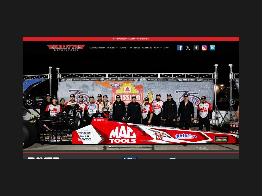
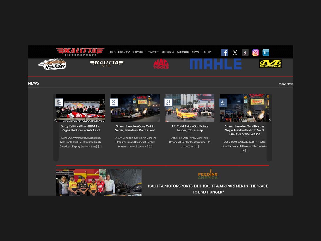
Before: The homepage introduces Kalitta through team photography and a large image carousel. The redesign builds on that identity with motion, driver experiences, and explanations of the sport.
The Objective
Kalitta’s leadership and marketing team gave Hounder wide creative freedom with one clear aim: make the website feel like race day. That translated into four concrete goals:
- Educate, don’t just sell: Help audiences unfamiliar with drag racing understand the sport, its machines, and the people behind them.
- Translate the track’s intensity on-screen: Motion, sound-inspired effects, and bold visuals that mimic the physical experience.
- Give every driver and sponsor a stage: A distinct, themed presence for each driver, and a home for the partners who make the team possible.
- Keep it easy to run: A system Kalitta’s team can update after every race without friction.
Project Results
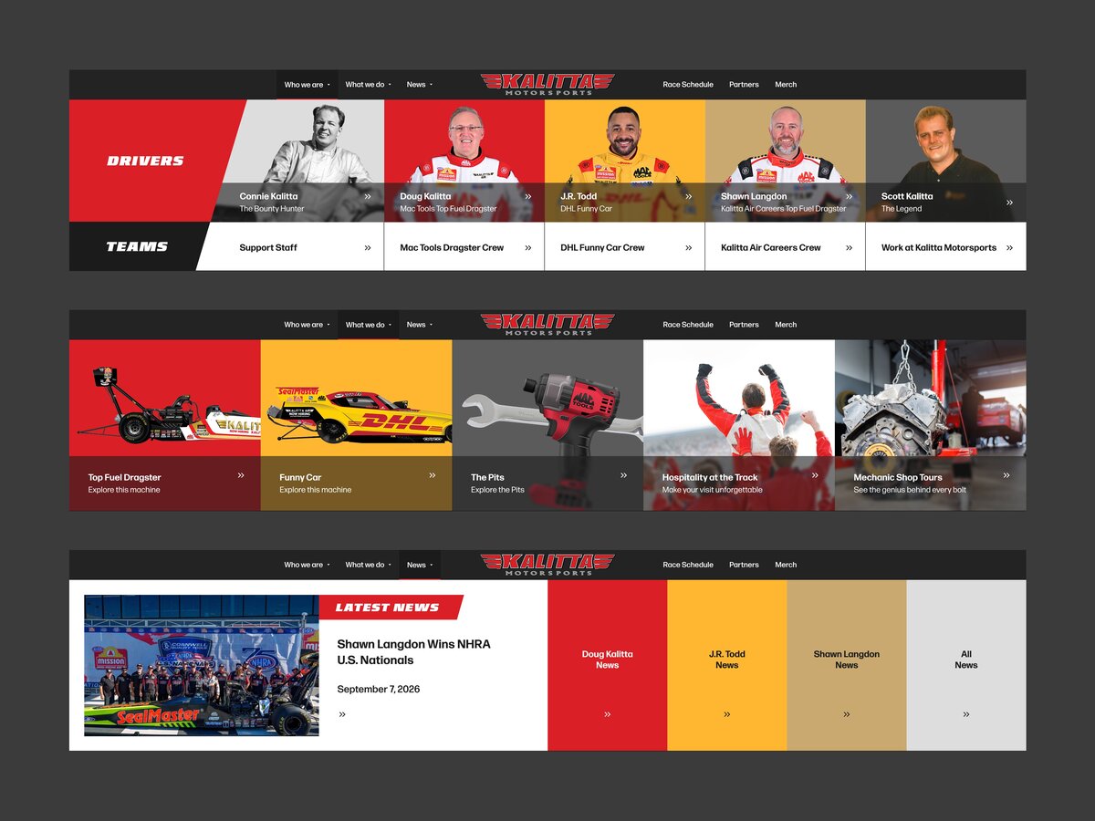
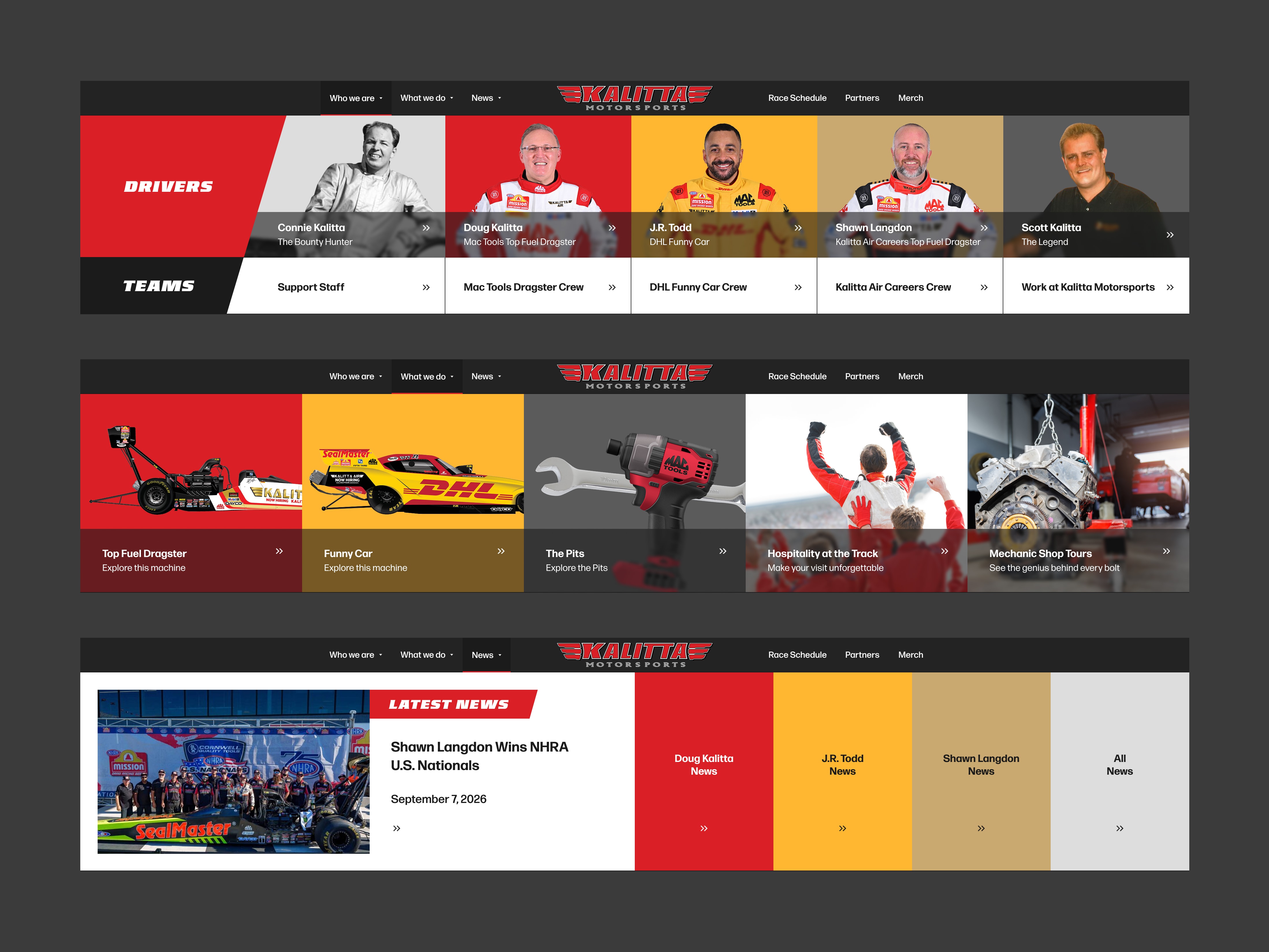
Hounder rebuilt the experience around discovery and following the team throughout the season. The redesign introduces new navigation, driver themes, educational content, and racing-inspired interactions. A WordPress site hosted on Pantheon supports the experience, with reusable components that keep pages consistent and give Kalitta’s team a repeatable editing process.
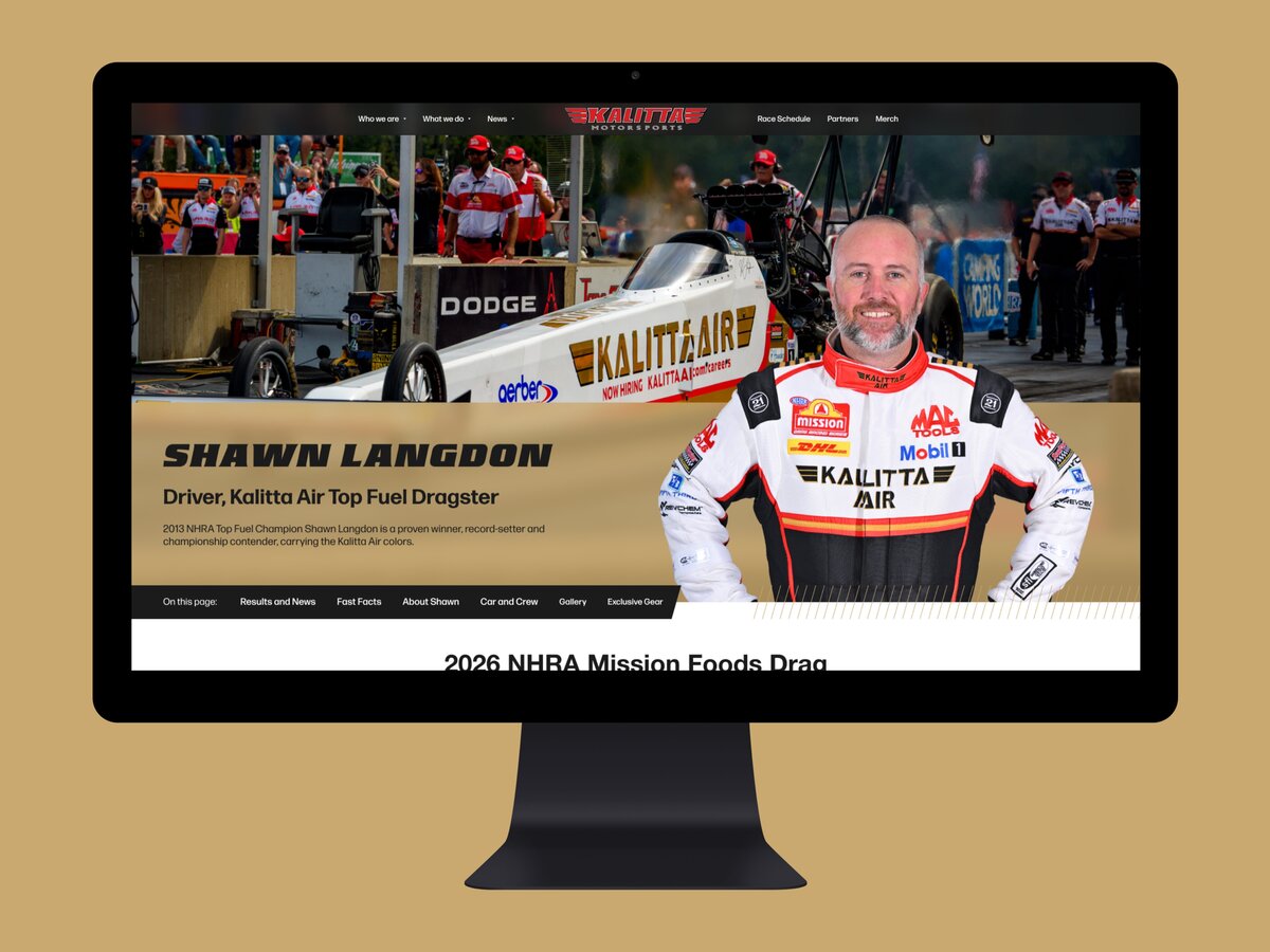
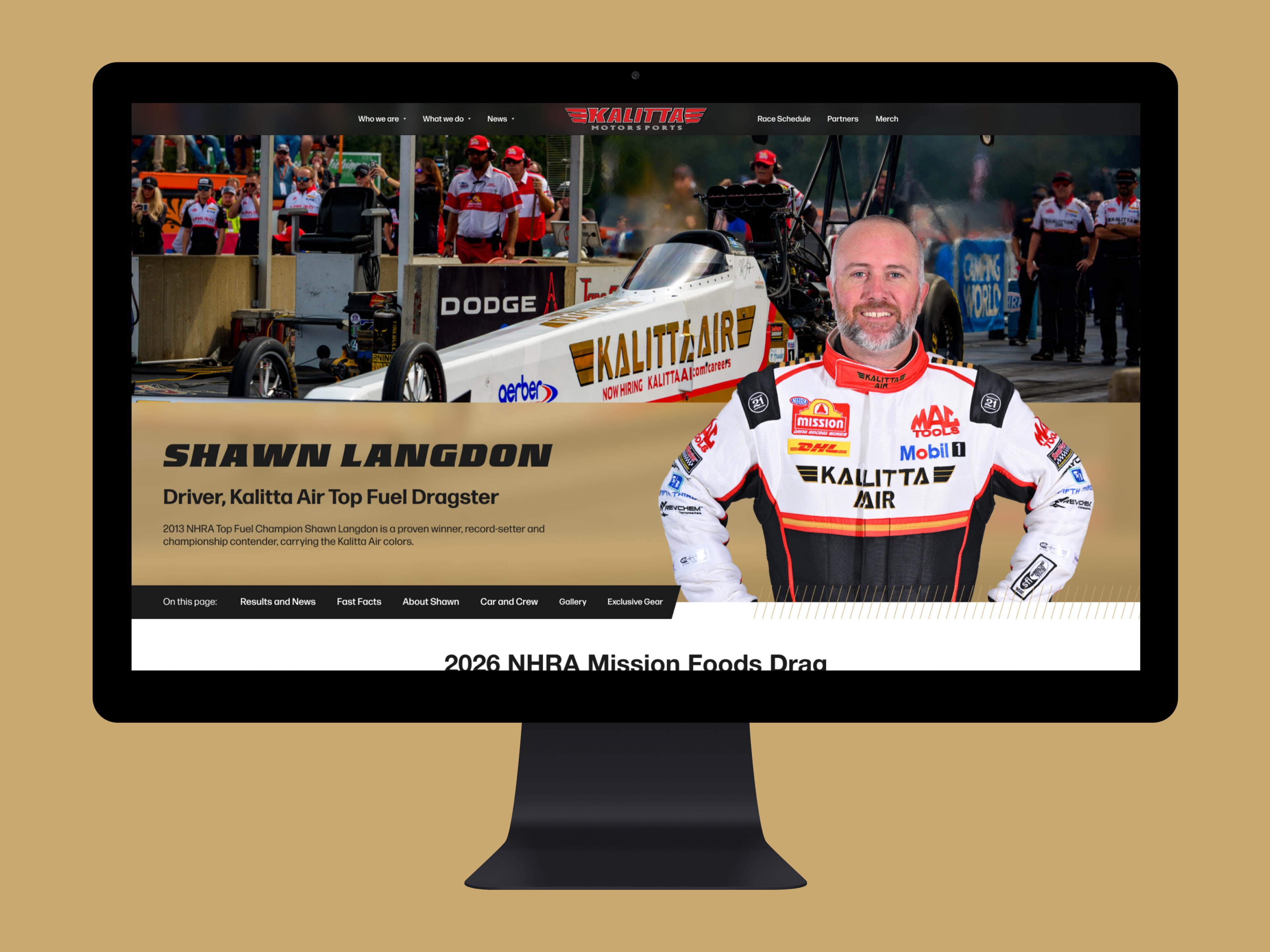
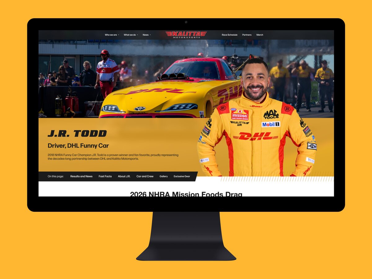
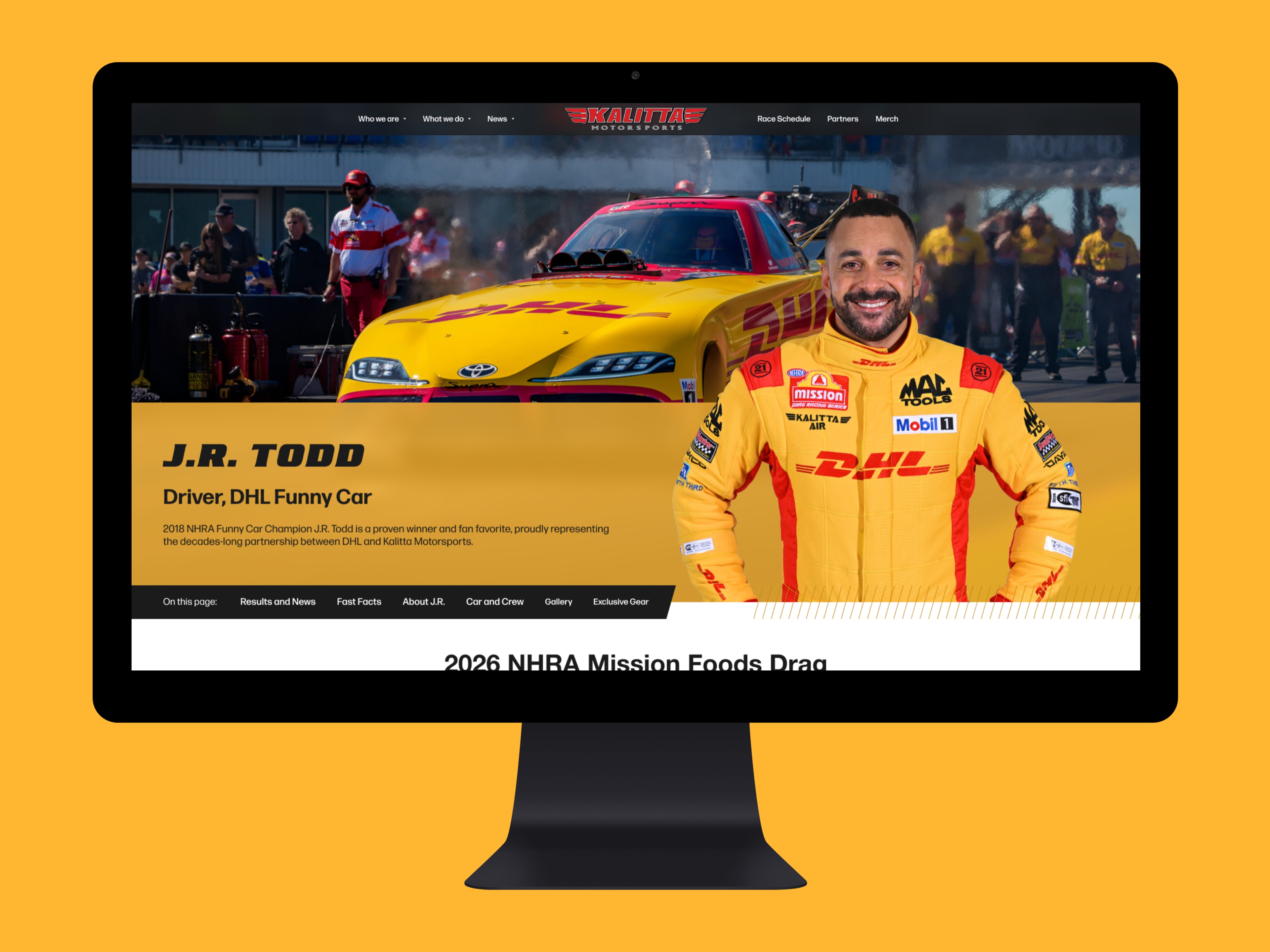
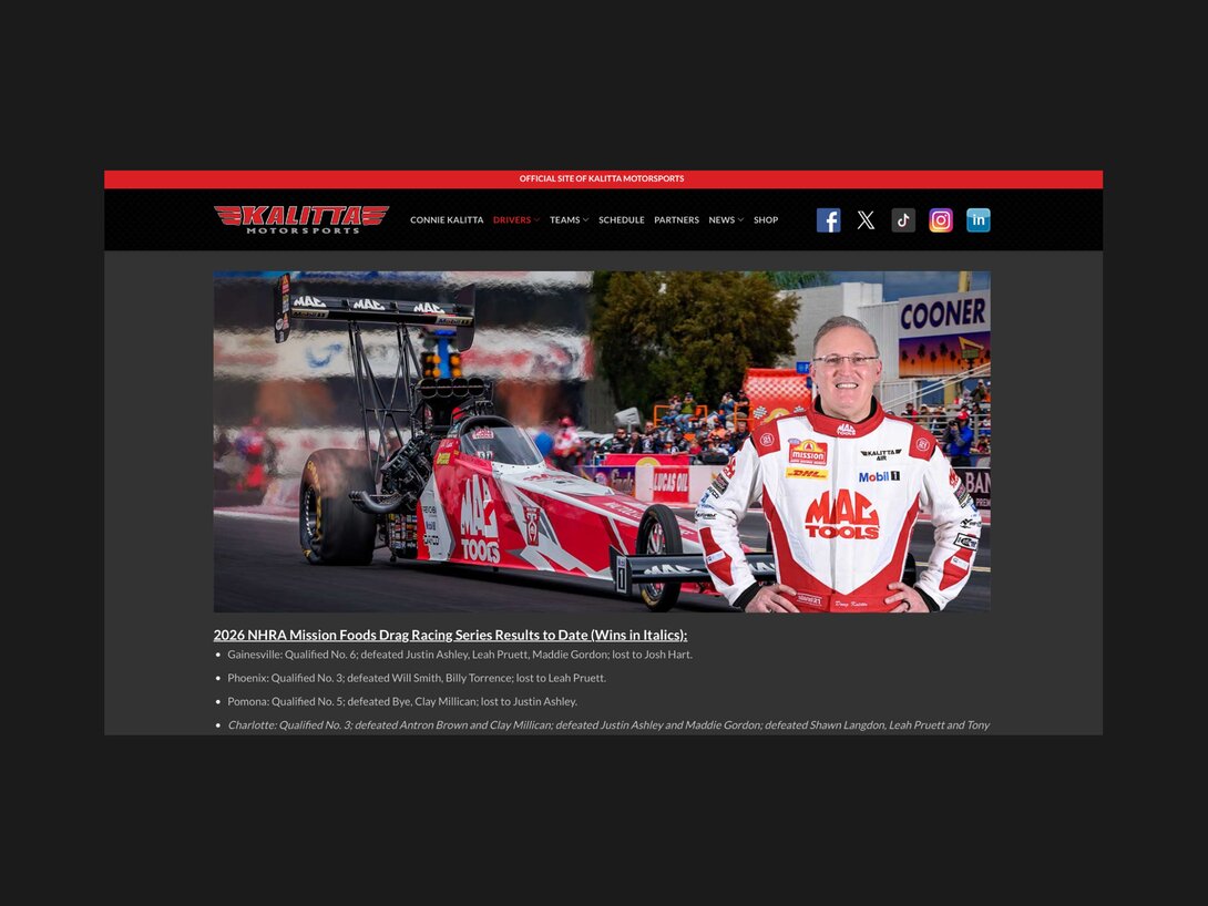
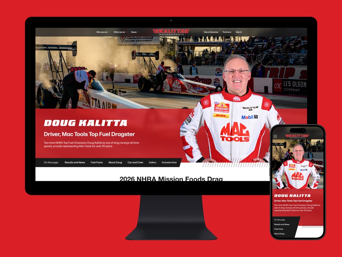
A distinct homepage for every driver: Driver pages bring together race results, related news, personal facts, and team information. Individual color themes distinguish J.R. Todd, Shawn Langdon, and Doug Kalitta while maintaining a shared page structure.
(Before)
(After)
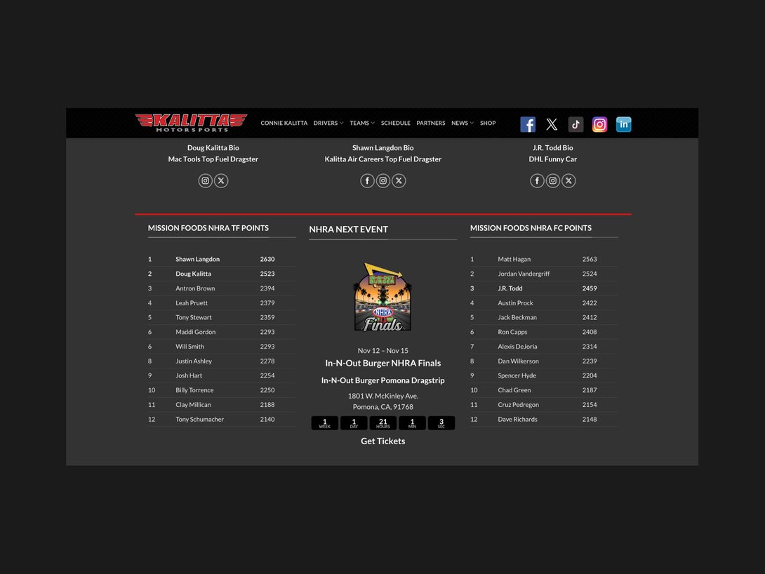
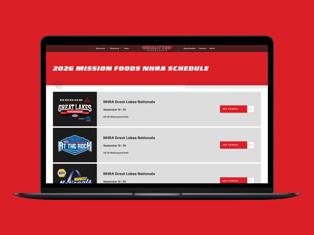
Race information organized for the season: This redesign gives the race schedule its own structured presentation. Event cards group the race name, dates, location, and available ticket links, with past events separated below.
(Before)
(After)
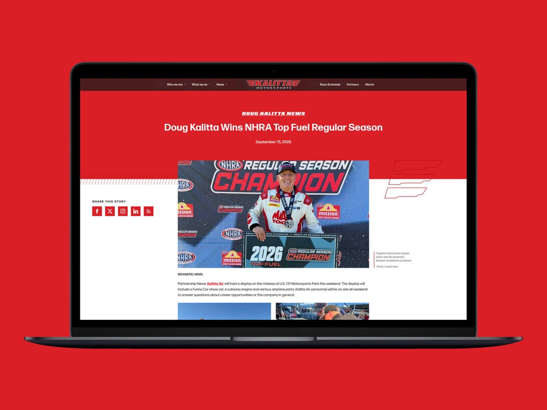
Racing personality throughout the news experience: News remains central to following Kalitta. The redesigned article experience carries the racing theme beyond the homepage with a finish-line-style timer and related team stories.
(Before)
(After)
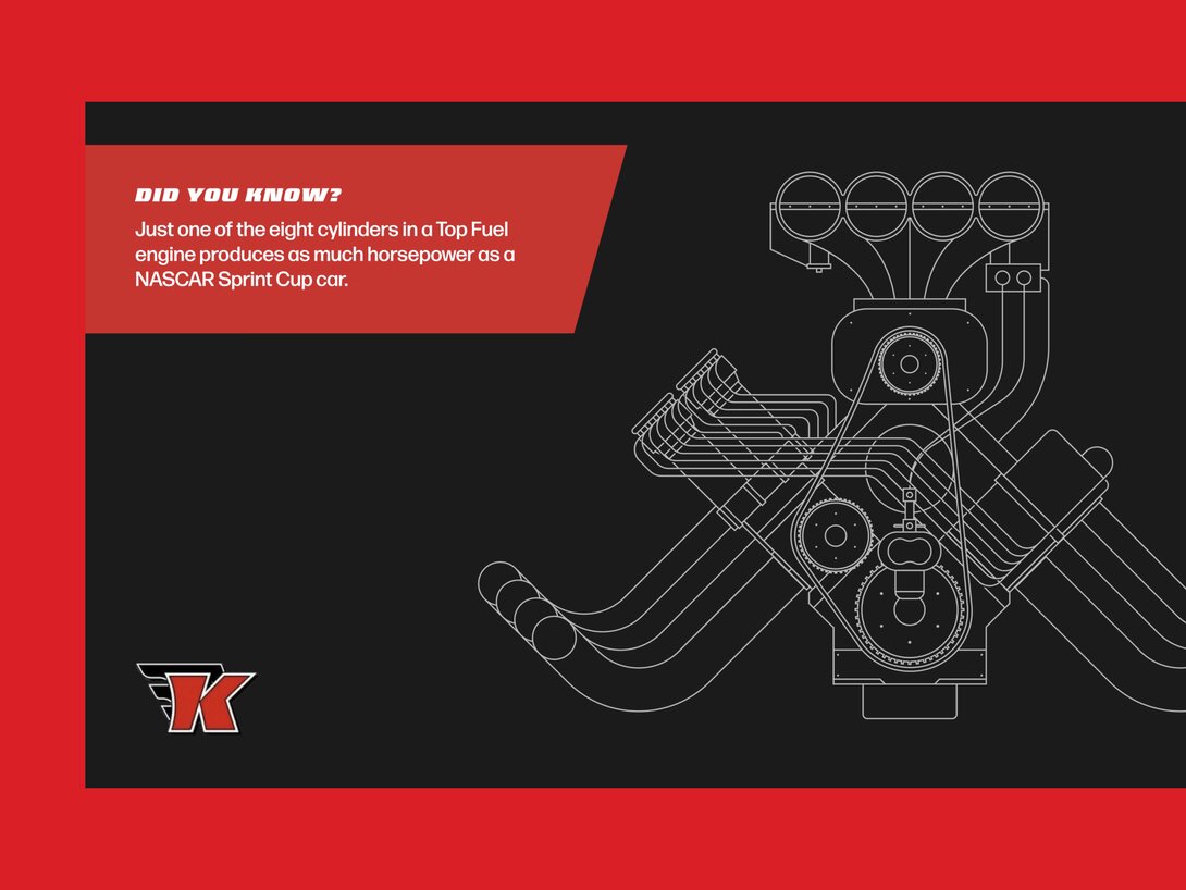
An introduction to the engineering behind the sport: The educational experience continues through Anatomy of Speed pages and a footer that pairs an engine illustration with rotating facts. These details help introduce the work behind each run and give visitors something to discover as they explore.
How We Did It
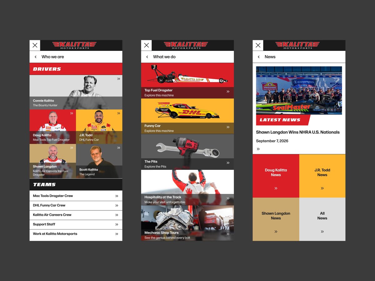
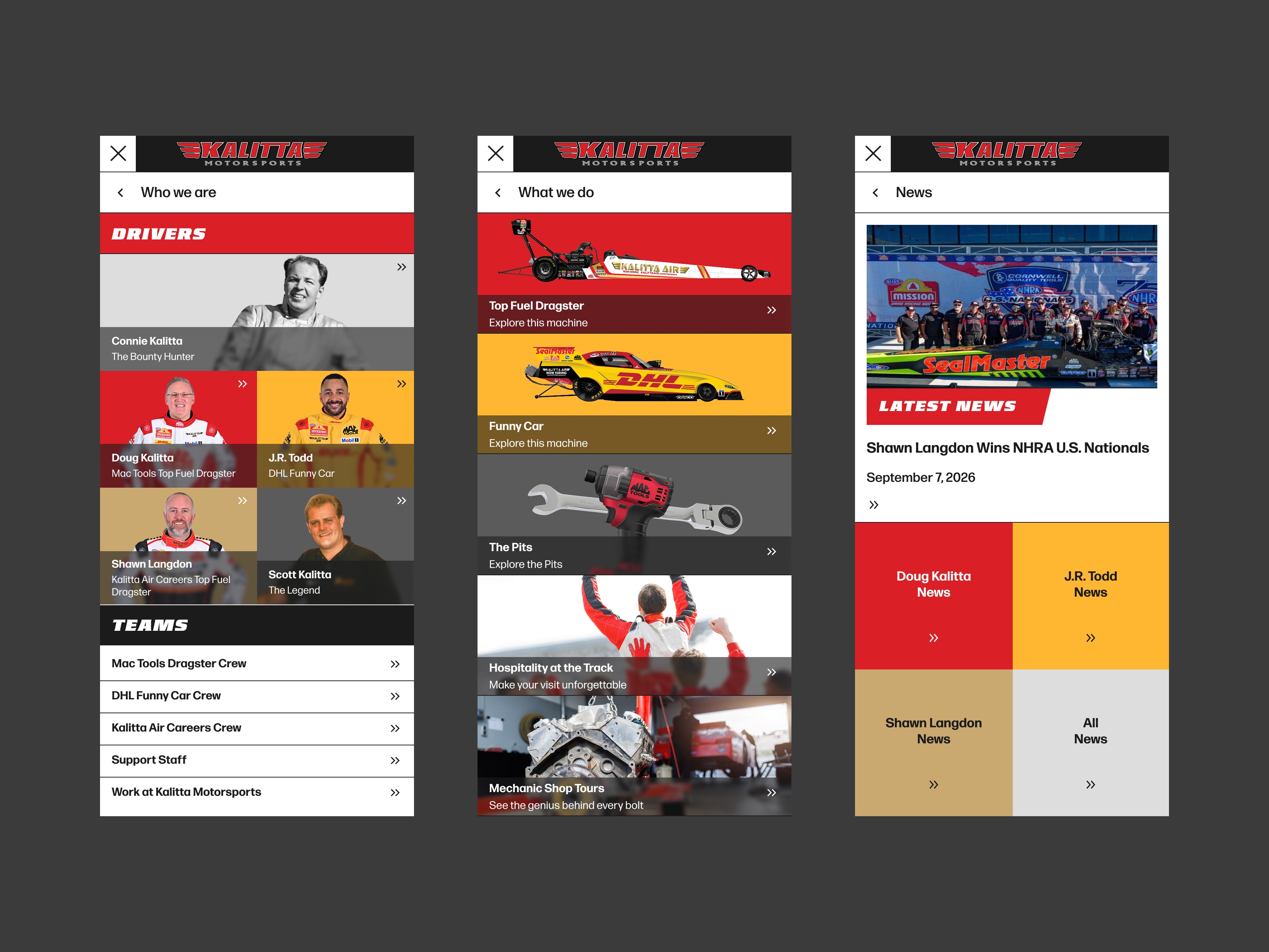
Design and development worked around a library of reusable components. That approach allowed driver pages to share a structure while using different color themes, and gave Kalitta’s authors a consistent way to assemble content. The custom visual navigation required particular attention. Its image proportions shifted across screen sizes, so the team refined the sizing behavior across desktop, tablet, and mobile layouts.
The team also adapted the opening experience as deadlines approached. Hounder brought a bit of the starting line to Kalitta’s homepage with a headline that shutters like an idling dragster waiting for the green light. The team fine-tuned the timing, compression, and blur to get the rumble right. The animation captured the race day and saved an estimated 2 weeks of development time.
What Made It Specific to Kalitta
Every detail borrows from the track. The headline effect was tuned over hours of timing adjustments (jitter, squeeze, compression, blur) to match the rumble of an idling dragster. The results icons mirror the rounds of an NHRA event. Sponsor logos scroll past like a racetrack wall. And a planned interactive launch sequence was replaced with that heat-text effect when deadlines and missing assets made the original impractical, saving roughly two weeks of development without losing the drama.
Behind the scenes, design and development worked as one team. Designs were built from reusable components rather than unique layouts, which kept development fast and gave Kalitta’s authors a straightforward editing experience, including training on the new WordPress site and the migration of a large news archive to the new platform. Just like a pit crew that tears down and rebuilds an engine between rounds, the project team had to be fast, precise, and in sync.