Project at a Glance
Initial Challenges
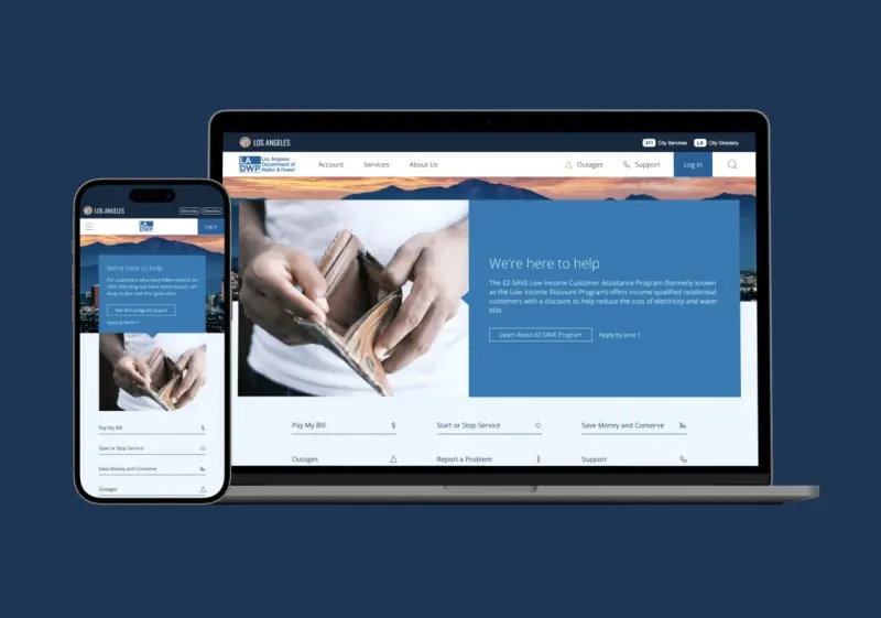
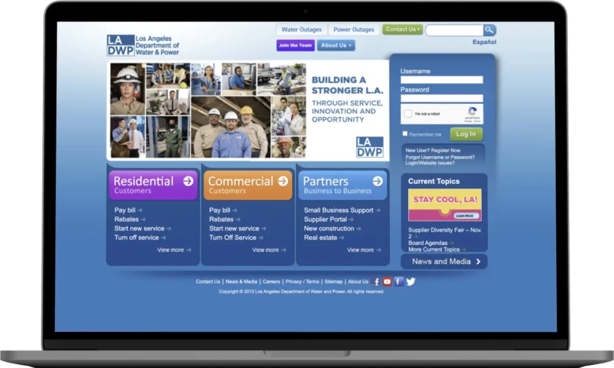
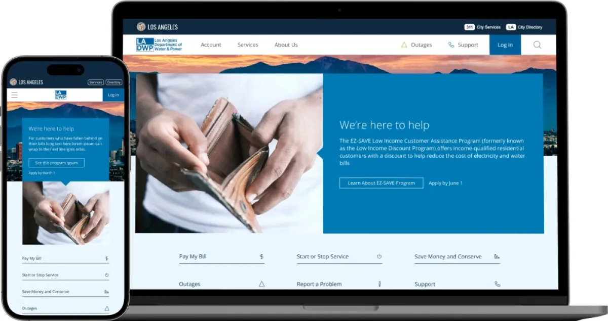
The existing LADWP website struggled to meet the evolving needs of its users. Customers faced challenges navigating a structure that made finding critical services—like bill payments, outage updates, or financial assistance programs—time-consuming and frustrating.
Additionally, the site required seamless integration with LADWP’s backend systems to maintain uninterrupted service delivery while supporting new design and functionality. This integration was essential to improving user experience without disrupting the vital services LADWP provides.
The Objective
The primary goal was to redesign the LADWP website into a modern, self-service Drupal platform that simplifies access to essential resources for Los Angeles residents. Specifically, the redesign sought to:
- Improve user accessibility: Reduce the number of clicks needed to access key services.
- Enhance responsiveness and accessibility: Ensure optimal performance across all devices and compliance with ADA standards.
- Foster long-term sustainability: Build a future-proof design that minimizes the need for frequent updates.

Project Results
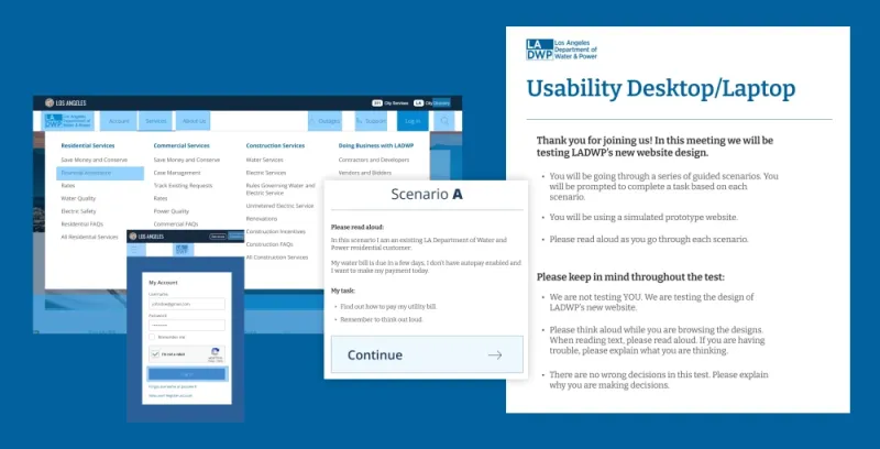
Hounder conducted rigorous user testing with a diverse group of LADWP customers, focusing on usability and accessibility. Real-time feedback was incorporated to refine the design further. After the project was completed and the website went live, the results spoke for themselves. Through Drupal, Hounder was able to help LADWP achieve:
- 80% faster login and bill payment process.
- 100% success rate in users finding necessary information.
- Significant reduction in customer support calls.
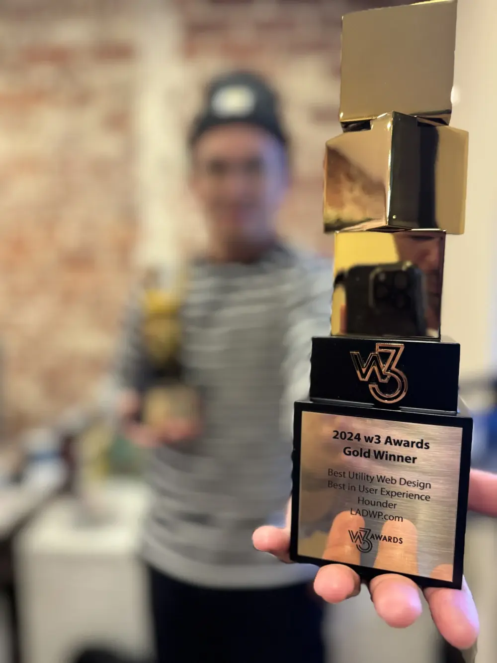
We even won Best Utility Web Design and Best in User Experience for this incredible project thanks to W3 Awards!
The approach
Hounder started with an in-depth discovery process to identify the website’s most critical user needs. Research revealed five primary goals users had when visiting the LADWP website:
- Pay my bills
- Get information on outages in my area
- Financial Assistance / Savings Programs
- Start or Stop service
- Water and Power Information for Construction
This research guided every step of the redesign process, from content audits to journey mapping.
Content audit & journey mapping
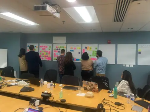
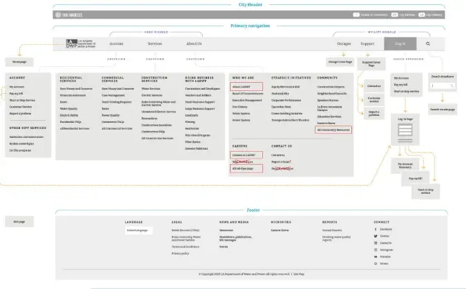
By conducting a content audit, the team could organize information more intuitively. The resulting journey maps outlined how users interact with the site and identified opportunities to streamline access to key services.
UX and UI Design
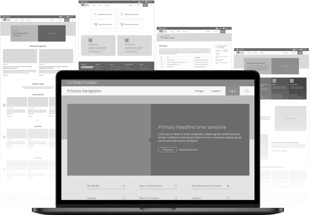
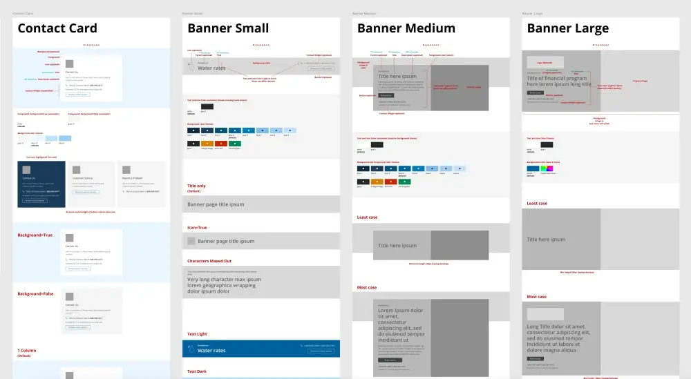
The design process began with grayscale wireframes to establish the building blocks for all components, layouts, and content types. This rapid prototyping phase helped identify weak points and optimize them early. Once the wireframes were validated, Hounder moved on to full-color user interface (UI) designs, creating a modern, cohesive visual identity.
Component Wireframes
Technical Highlights
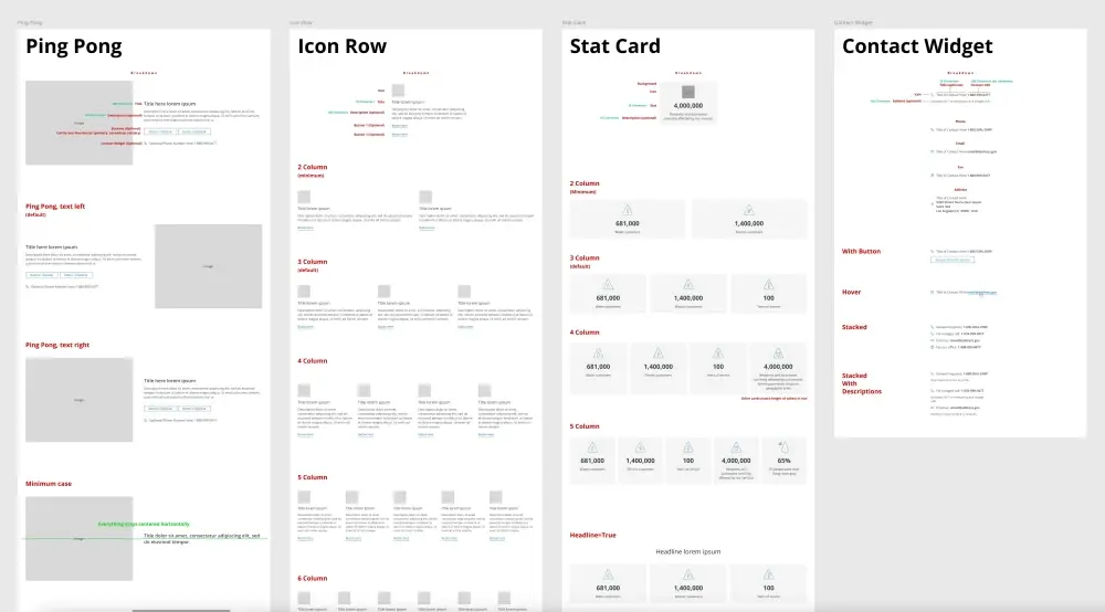
The new LADWP website uses 33 unique templates and over 40 robust components with more than 400 variations, allowing for flexible and scalable content management within the Drupal platform.
Drupal’s modular architecture allowed us to build these custom components efficiently while ensuring seamless integration with LADWP’s backend systems.
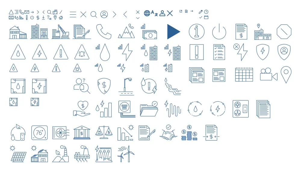
114 custom icons
The creation of 114 custom icons contributed to a modern and unique visual experience, helping to distinguish the LADWP site from other utility providers and enhancing the overall aesthetic appeal. These icons also improved the site's navigational intuitiveness, making it easier for users to find the information they need quickly.
Overall, these technical enhancements fostered a more engaging, accessible, and effective online presence for LADWP, meeting the diverse needs of its users while ensuring compliance and visibility in a competitive digital landscape.
User testing and results
We conducted extensive user testing with a diverse demographic to validate the design's effectiveness, resulting in a high success rate in usability tests. Adjustments were made based on real-time feedback, ensuring the site met actual, boots-on-the-ground user demands
The Impact
The redesigned LADWP website now offers an intuitive, streamlined experience that empowers users to complete tasks efficiently. Notable achievements include:
- A drastic reduction in the time required for bill payments and service management.
- Increased customer satisfaction, as users can now easily navigate the site and access resources.
- Enhanced operational efficiency due to fewer support calls and better self-service options.
"Hounder was so incredible to work with. They were extremely thoughtful and were a constant advocate for the customer's needs. They're a highly sought-after team and we were so thrilled to work with them! Not to mention the website turned out amazing!"
-Renee Vasquez, LADWP
Key takeaways
LADWP’s website redesign showcases how leveraging Drupal’s robust capabilities can transform user experience while addressing complex technical requirements. By streamlining navigation, enhancing accessibility, and integrating flexible design components, LADWP has significantly improved its digital presence.
Hounder’s human-centered design, combined with Drupal’s technological capabilities, effectively catered to the diverse user needs, not only meeting current demands but also equipping them to adapt to future challenges.
