
This is a build-on from our 2025 CTA guide. Check out our first one for some other key findings we've found over the years.
If you notice your CTAs aren’t driving the level of engagement/conversions that you’re aiming for, you’ve come to the right place. It’s time to reevaluate the messaging you’re inserting into your call-to-actions and if that’s something your audience resonates with.
We’ll start with general insights, and then share some industry-specific insights to help those who might be in the government, higher ed, and call-to-action strategies that can help you even further.
Above All: Create a Low Barrier to Entry
Nowadays, hardly anyone has the time or enough interest in “scheduling a demo”. That’s the most common CTA in the B2B industry. Instead, it’s important to show upfront value. Instead of the user scheduling a meeting to get sold to, include a button for watching a demo right then and there. Or better yet, a free trial opportunity. Either option sounds way more appealing than fitting a demo call in their calendar.
Creating a low barrier to entry makes it an easier decision for visitors to actually click the button and take action. Plus, converting your CTAs to be more self-service makes someone click and look further into your service. Because let’s face it: people don’t want to talk face-to-face as much anymore.
Perceived Value vs. Intrusiveness
There’s a growing perception that the "Schedule a Demo" CTA and others that require a high commitment are more about generating leads for the company than providing value to the customer. In the eyes of many prospects, it feels like a sales tactic rather than a genuine effort to help them solve a problem.
This perceived lack of value can make the CTA feel intrusive, especially when it’s pushed too early in the buyer’s journey. Customers are increasingly wary of giving up their time and personal information without a clear, immediate benefit. If they don’t see the value upfront, they’re likely to view the request for a demo as an unwelcome interruption rather than a helpful offer.
The 3 P’s for CTAs
Placement, Presentation, and Personalization.
The success of your CTAs depends on these three P’s. First, there’s placement. If your primary CTA is below the fold on the page or too small, it’s not going to grab the attention of the user. Make sure, no matter if it’s a form or a button, that the component is front and center and/or where users would expect it most.
Presentation comes next. The design of your CTA is one of the most important aspects you need to evaluate. The color alone can communicate certain feelings to the visitor upon first glance:
Red conveys urgency and works well for limited-time offers.
Green often signals trust and balance, making it a strong choice for lower-pressure actions like downloads.
Blue communicates confidence and reliability, which is why it’s frequently used across industries like tech, security, and healthcare to build trust at a glance.
These are just a few examples. While color psychology can influence behavior, your CTAs should still align with your overall brand identity to feel cohesive and credible.
Accessibility is another critical part of your CTA presentation. To meet WCAG AA guidelines, normal text should maintain a contrast ratio of at least 4.5:1, while large text should meet a 3:1 ratio. In practice, this means avoiding low-contrast combinations like light text on light backgrounds or dark on dark, especially for buttons and interactive elements.
Finally, there’s personalization. According to Hubspot, personalized call-to-actions perform 202% better than basic CTAs. This is why it’s so important to deeply understand your audience. When you know who you’re speaking to (and where they are in their journey), you can create thoughtful, relevant CTAs that feel like a natural next step rather than a hard sell.
Effective CTA Examples for Your Industry
Now that we’ve covered what not to do for your CTAs, let’s go over some industry-specific examples that show what you can be doing within your sector to ensure you’re grabbing the attention and commitment of your target audience.
Government CTA Examples
For the public sector, your users want to get what they need fast and leave your site. It’s the hard truth you have to face, especially when, for example, you’re a county that offers payment services for bills that people are required to pay. It’s not like a retail site that someone craves to scroll through when looking for their next outfit.
This is exactly why your call-to-action buttons need to be crystal clear as to what action it’s taking the user through. If they need to pay a bill, there should be a clear button that shows where they can complete that task.
A great example of this would be the Los Angeles Department of Water & Power’s website. Since they are a utility company, the actions their users will likely take are pretty obvious, so the buttons to accomplish said tasks should also be straightforward.
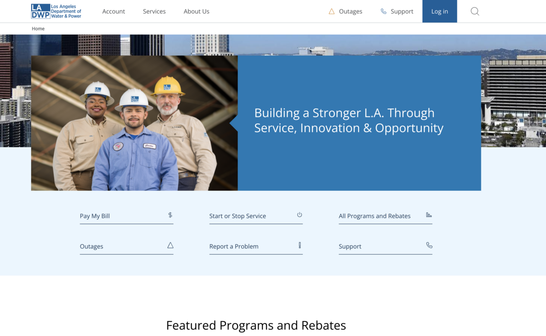
When we went into designing the LADWP website, we made sure key actions were clear buttons above the fold. This includes tasks such as paying a bill, starting/stopping service, finding out about outages, etc.
Ideally, there shouldn’t be anything else on this type of page distracting or overwhelms the visitor on what they should do next. Don’t focus on a flashy design when a government site needs to be clean cut for users to get in and get out. Trust us, this approach will yield fewer support calls and more positive feedback from your residents.
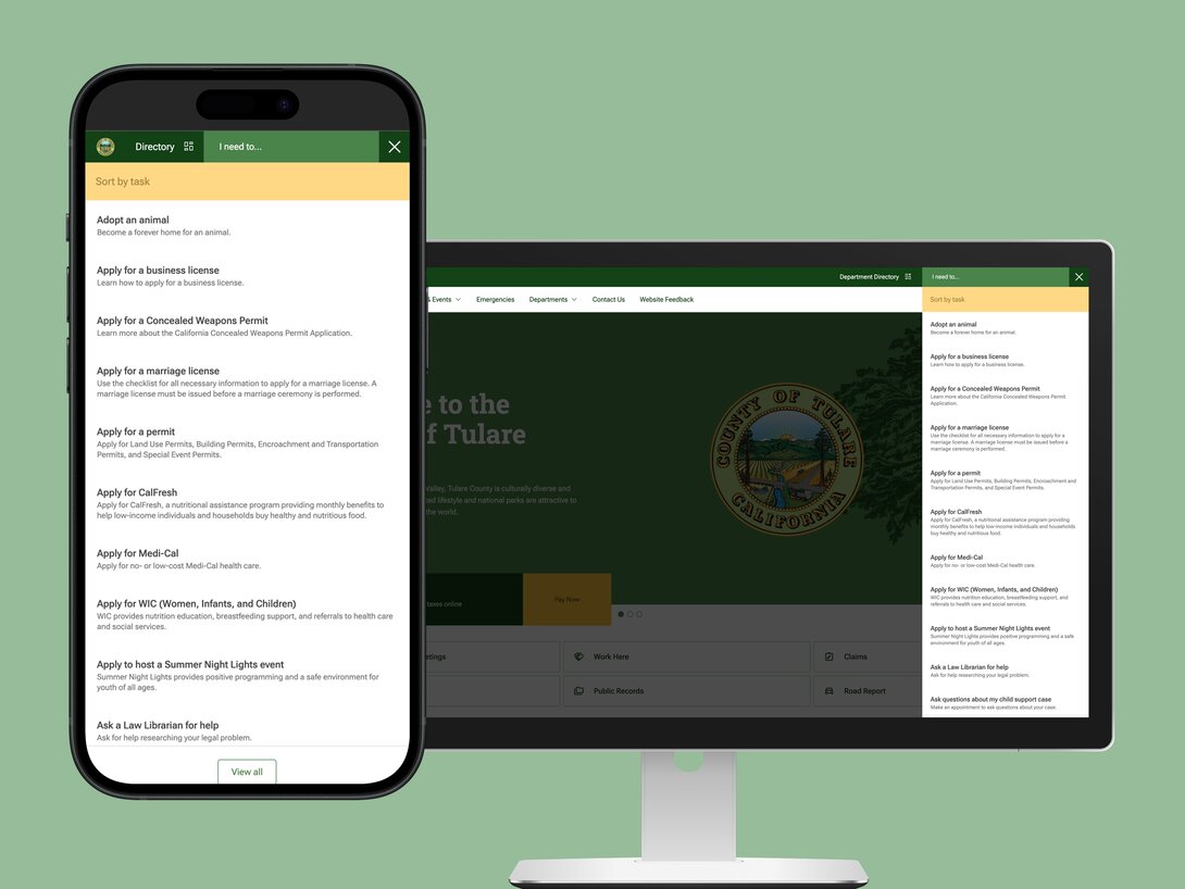
If you need to include forms as your CTA, make sure it’s not a lengthy process for the user. For example, we knew that Tulare County had to have a lot of different forms on their site, so we ensured that it was a simple click away if it was on a different page, and then that brings them to a form where there are only the necessary fields required to fill out for a short and easy process.
Higher Ed CTA Examples
For higher ed, you’re speaking to a handful of different audiences with different needs. You have parents, students, faculty, and even alumni who will visit your site and supporting channels. In order to make their different journeys seamless, your CTAs and buttons need to be tailored towards their differing needs.
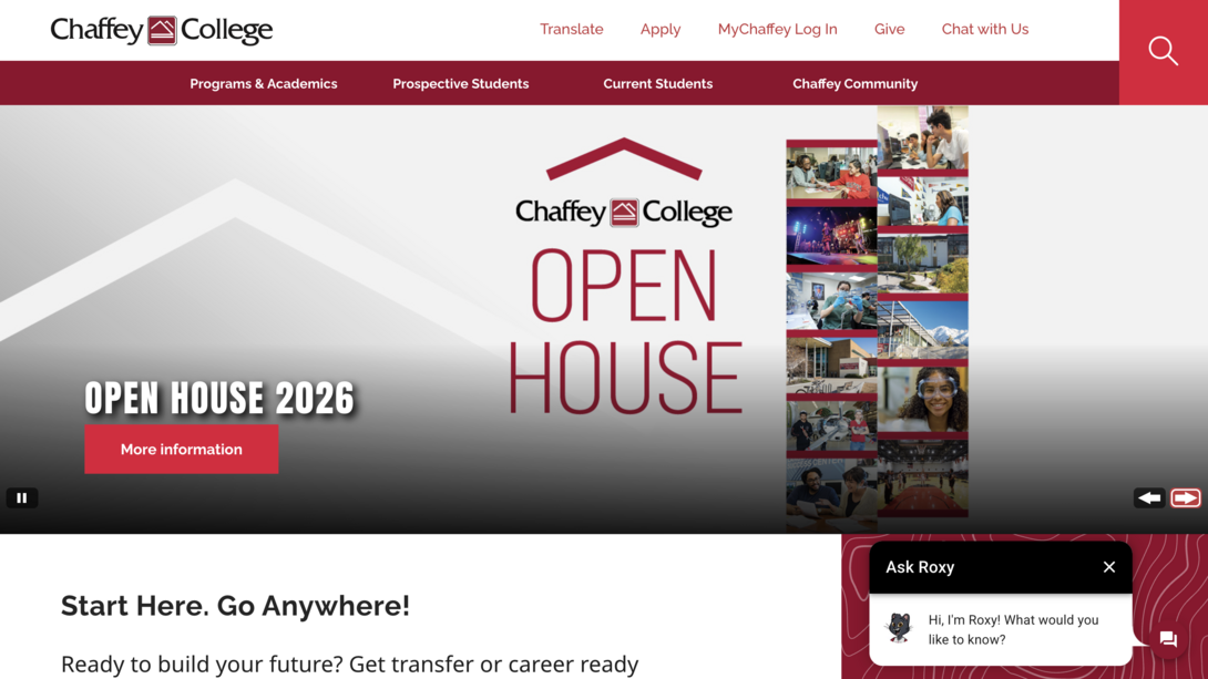
Chaffey College
Chaffey College completely revamped the digital experience for students (shoutout to Pathify). Not only are their buttons clear for each audience (like prospective students, current students, and alumni) but they’ve transformed the orientation process to be less manual by allowing students to register via mobile devices/QR codes.
Seeing how Pathify helped Chaffey College revamp its processes by leveraging technology is a perfect example of how you can have your platforms work harder for you and lessen the burden on your staff and students. This can be as simple as making CTAs clear and more specific, like improving registration processes.
Healthcare CTA Examples
Healthcare CTAs come with a unique challenge: users are often stressed, short on time, or dealing with sensitive situations. That means clarity, trust, and reassurance matter just as much as conversion. Similar to the government sector, the truth of it is that your audience doesn’t want to stay on your website for very long. Therefore, you need to get them what they need fast.
Common healthcare user goals include:
- Scheduling an appointment
- Finding a provider
- Accessing patient portals
- Paying a bill
- Getting directions or urgent information
- Use plain, human language
- Reduce anxiety by setting clear expectations
Examples of strong healthcare CTAs could be:
- Find a doctor near you
- Schedule an appointment online
- Access your patient portal
- View urgent care wait times
- Pay your bill securely
Avoid vague or marketing-heavy language. A CTA like “Contact Us” is far less helpful than “Schedule an appointment” or “Talk to a care coordinator.”
When possible, self-service options are especially valuable. Allowing patients to complete tasks online (especially without calling or waiting on hold) creates a more supportive experience and reduces strain on staff.
Just as important: don’t overwhelm users with too many choices at once. In healthcare, fewer, more focused CTAs often perform better because they help users quickly identify the right next step.
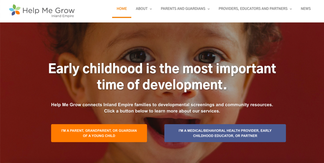
A great example of this is Loma Linda University’s children’s health program called Help Me Grow IE. Right when someone lands on the page it becomes a kind of “choose your own adventure” journey where you select what audience you are (e.g., a parent of a young child or a health provider). This leaves little room for confusion and brings visitors to exactly the right information that’s tailored to their needs.
Read our full case study to see how we implemented Drupal forms compatible with Epic EMR to streamline submissions and data collection/organization.
It’s time to make your CTAs work smarter.
Just as you expect your teams to work smarter, not harder, the same mindset should apply to your CTAs. When call-to-actions are thoughtfully placed, well-designed, and personalized to your audience, they become a natural part of the user journey instead of an interruption or an eyesore.
If this guide sparked ideas for improving your CTAs, the next step is looking at the bigger picture. CTAs don’t exist in a vacuum; they’re shaped by everything a visitor experiences from the moment they land on your site to the moment they decide to leave.
If you feel there’s room to improve your website’s user journey, we’re here to help. Our team can help you identify friction points, refine messaging, and create a path that guides visitors toward action with clarity and purpose. You in? Let’s talk.