
Higher Ed organizations cater to a large array of personas, generations, and individuals with unique goals. From parents, students, to faculty, your website should be an up-to-date, easy-to-use hub that gives each of these buckets exactly what they need.
Universities have a lot of resources and information, so your website can easily get away from you and become overwhelming for the user if you don’t stay on top of it. The following sites we’ve handpicked are going to help you identify some strategies you can take inspiration from to cultivate a strong, engaging user experience.
Ready to get those creative juices flowing?
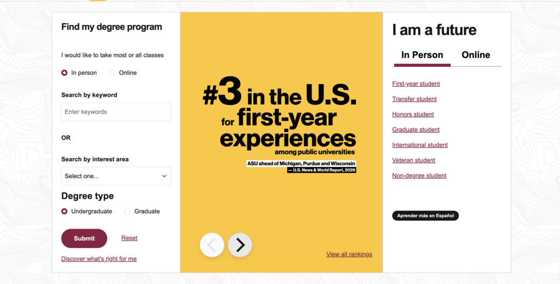
1: Arizona State University
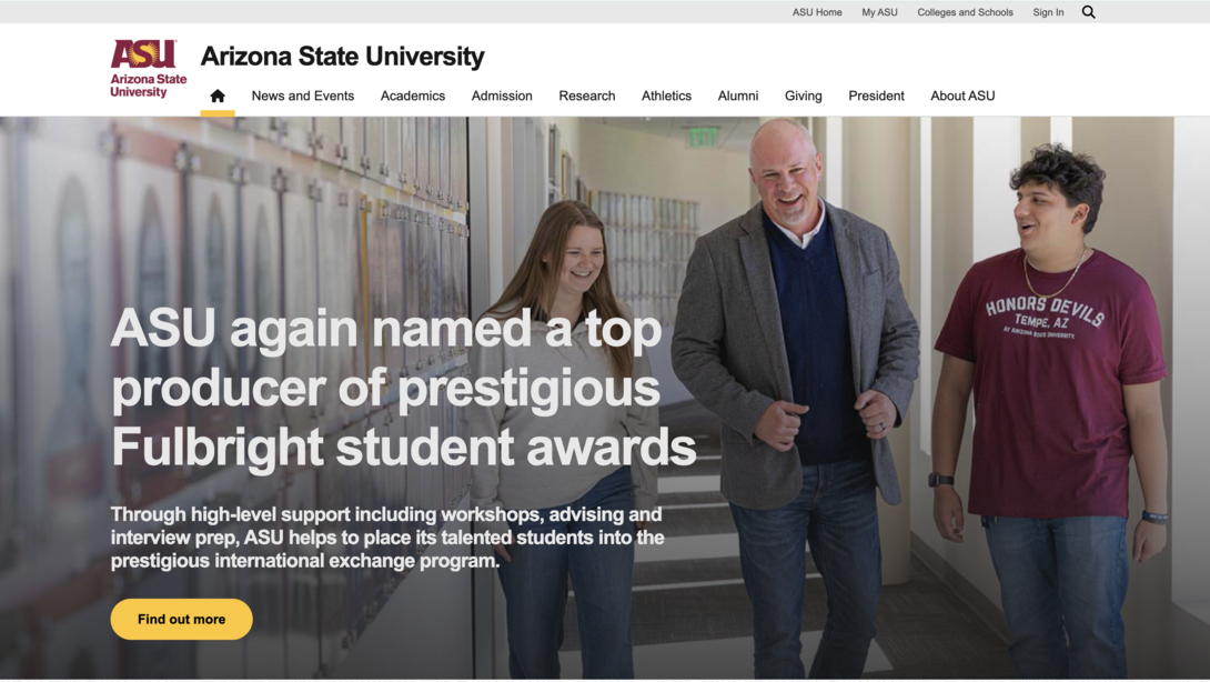
Arizona State University offers useful filtering that allows visitors to peruse the field/degree options they’re most interested in. This particular organization provides in-person and online programs, so clear search functionality is key to ensure that users are taking the path that they came to the site for, since ASU has different websites depending on whether the student is looking for in-person or virtual schooling.
You’ll also find a pop-up for users to provide feedback on the experience they’re having, which you can leverage when you’re planning any changes/adjustments for your website.
2: Penn State
Penn State’s website is a killer example of how to deliver a focused and engaging digital experience. From the moment visitors land on their homepage, high-quality video and immersive visuals immediately set the tone, highlighting campus life and student outcomes in a way that feels energetic without being overwhelming.
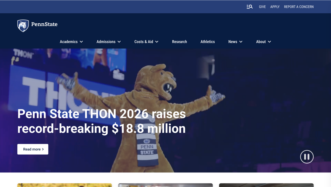
In addition to the homepage design, the navigation remains very clean. Key audiences (prospective students, current students, alumni, faculty, and supporters) can quickly self-select their path without digging through layers of menus. This persona-driven navigation helps reduce friction and ensures visitors can quickly find what they need, whether they’re researching academic programs, exploring admissions, or looking for news and events.
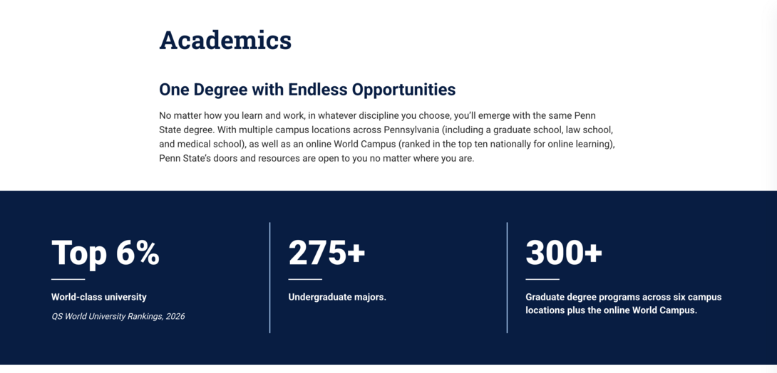
We love the quantifiable data they utilize to reinforce credibility and reputation. Rather than relying solely on aspirational messaging, the site highlights concrete metrics to provide proof points that back up its claims. These data-driven moments build trust and help prospective students, parents, and partners understand the university’s real-world impact at a glance.
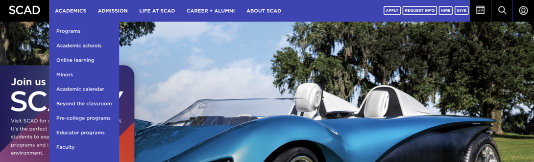
3: SCAD
SCAD’s website strongly exemplifies how an arts-focused institution can fully embrace creativity without sacrificing usability. The layout of this site immediately reflects the school’s artistic identity, setting clear expectations for what SCAD stands for and who it serves. The bold color palettes and expressive visuals feel intentional and curated, not decorative for decoration’s sake.
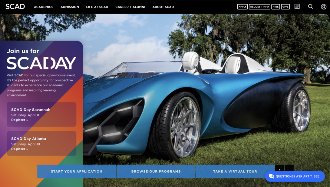
What makes the experience work is the balance between creative freedom and functional UX/UI. Despite the visual richness, navigation remains intuitive and well-structured, allowing prospective students, parents, and creatives to explore programs, admissions, and student work without clunkiness. SCAD proves that a visually distinctive design can still be highly usable and that brand expression and clarity don’t have to compete. This balance is a key reason the site stands out among higher education websites.
4: Clemson University
Clemson takes the cake for bold branding that stays consistent across all of their pages. They put a clear focus on student and community stories, showcasing the success individuals have achieved after attending the college or events that are happening on campus.
Right from the start, the user journey is made clear thanks to the CTAs that help you, no matter if you’re a fresh visitor or already admitted.
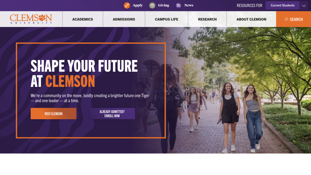
Where Clemson really takes things a step further is with its chatbot feature, positioned unobtrusively in the bottom-right corner of the site. Instead of forcing users to dig through menus or search endlessly, the chatbot acts as a helpful guide offers quick answers, directing visitors to the right pages, and supporting users when they’re not quite sure where to start. It’s a smart addition that enhances usability without interrupting the overall experience.
By offering multiple, complementary paths to information (clear navigation, searchable content, and conversational assistance), Clemson successfully covers a broad range of user preferences without overwhelming visitors with too many options. This layered approach to wayfinding is a great example of how higher education websites can improve accessibility and user confidence while keeping the interface clean and focused.
5: Fashion Institute of Technology
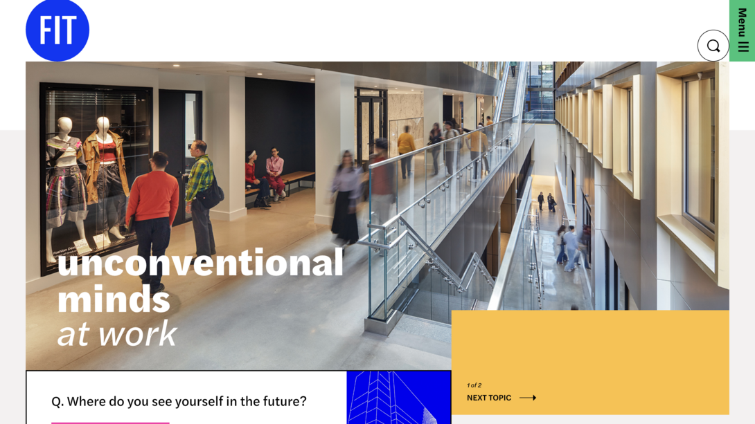
Instead of a traditional navigation, the Fashion Institute of Technology (FIT) takes the approach to minimize the menu to the right to focus more on the content that’s on the homepage. There’s no right or wrong to this, but if you notice you have an overwhelming navigation, creating more room for it via a fully expandable pop-out on the side could be a viable option.
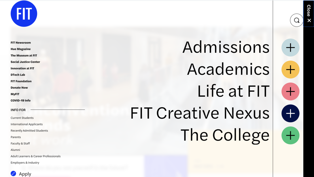
Some other features to point out on FIT’s website are the bright and creative brand energy, which reflects the industry they teach in. This institution perfectly encapsulates the school’s overall vibe and what you come to expect from a fashion university.
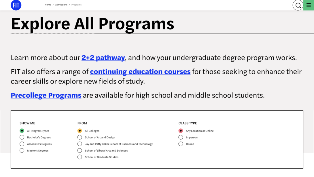
FIT also has a useful program filtering section where parents and students can explore the various majors and degrees that are offered. This makes the discovery process a little less daunting and helps individuals narrow down to what they want to focus their career on.
6: Augusta University
We’ve covered a lot about higher ed homepages, but what about student portals? As we were curating this list, Augusta University’s portal MyAugusta stood out to us as a clean and user-friendly platform for their students to receive vital information/communications. It’s even accessible via a mobile app, and it’s all thanks to the work that Pathify put into making this a crystal clear user journey.
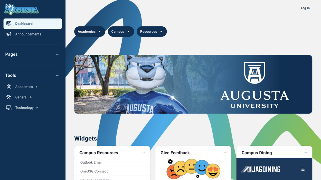
This is the perfect one-stop shop for everything a student or faculty member might need. Not only are there valuable resources, but this is the place where students can locate key contact information to get them in front of the right people they are looking to talk to.
All of this stuff shouldn’t be hidden or in areas where it takes leaps and bounds for one to access. Users nowadays want to find what they need fast, meaning, in just a couple clicks. If your site and/or portals can’t do that, you’re already stirring frustration among your students and staff.
7: Bates College
Bates College is a great example of showcasing key actions right at the beginning of the page for visitors to take action as soon as possible. Plus, you’ll find a collapsible navigation that better organizes information in a clean, functional way.
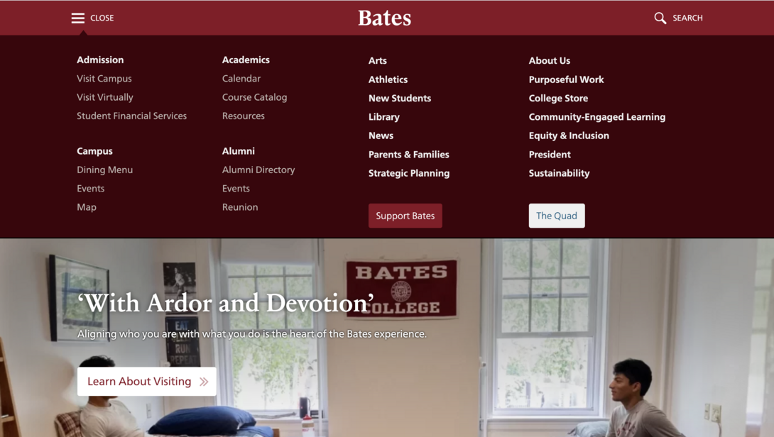
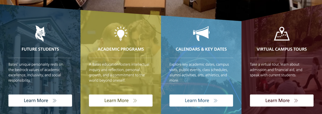
This university also prominently features social content, which caters to the younger generation who is their core audience. When curating your web content, you have to put yourself in the shoes of your target user and leverage what piques their interest/goals.
8: University of Georgia
The University of Georgia is another great one that showcases video well, while also compellingly displaying quantitative data. The overall design is crisp and clear, making it easy to navigate, no matter if you’re a student, parent, teacher, faculty member, etc.
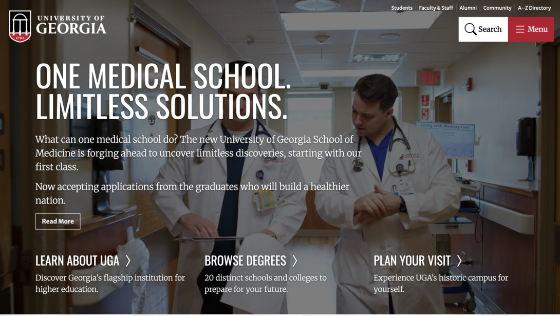
They also offer an accessible directory you can quickly search through in case you’re looking for certain programs, departments, etc. Offering seamless search functionality is crucial in minimizing support calls from your users who might be questioning if they’re in the right place. Your university’s website should be self-service so that you lessen the burden on your support staff.
9: Iowa State University
Iowa State University does a phenomenal job of being informative while not cluttering the page with too much content. They strongly feature student stories as well as upcoming events that the community can participate in.
While maintaining a strong brand, the homepage features must-have information and CTAs that clearly state what action the button will take the visitor through. Iowa State understands their various audience/user types and features a helpful “choose your own adventure” experience where visitors can select what type of student they are, such as a first-year, transfer, graduate, nondegree, or military student.
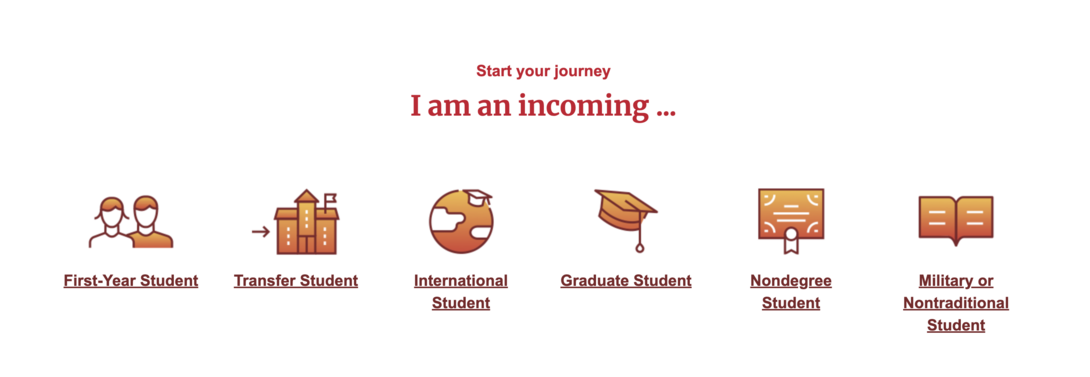
Once one of those is clicked, it will bring you to the exact page you need for certain admissions information for your particular type of incoming student.
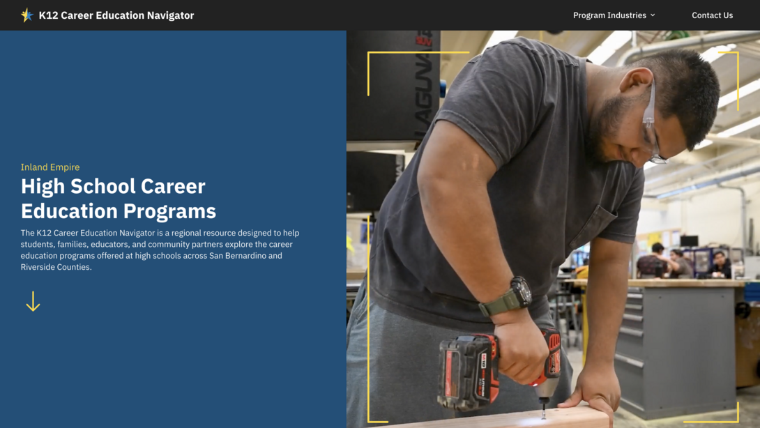
Honorable Mention: San Bernardino County School Systems Careers Map
While not directly a university, the San Bernardino County School Systems Careers Map stands out for how clearly it connects education to real-world outcomes. We designed this platform as an intuitive, interactive career exploration tool. This allows users to search, filter, and visualize career pathways tied directly to available programs. Students and parents can easily explore future opportunities, understand what programs lead to which careers, and make more informed decisions about education and training.
What makes a higher ed website great is its ability to cater to multiple audiences without feeling confusing. Beyond students and parents, the careers map is a valuable tool for school districts looking to align curriculum to workforce needs. In addition to that, this gives employers better visibility into the programs that are shaping the future talent pool they’ll be selecting from.
By bringing education, career pathways, and workforce demand into a single, easy-to-navigate experience, the site demonstrates how higher ed and education-focused websites can move beyond static content and become strategic planning tools.
Ready to Get On This List?
We hope this list has helped give you some inspiration on some features/design techniques that you can start implementing into your university’s website. It’s important to incorporate a blend of your brand while also offering an easy and engaging digital experience for each and every one of your users.
Think of your website as a place that will often be an individual’s first impression of your school. Not only that, but it’s also a place where students and staff will continue to visit to access certain resources, so you want to make it something that they don’t dread going to every time they need it.
You’re in luck, because this is our jam. Reach out to our team, and we’d love to hear what your upcoming goals are for your university.