As we move further into 2025, user-friendly government websites have become essential in delivering efficient and accessible public services. It’s often stated that “good web design” and “government websites” often don’t go hand in hand. But what if we changed the narrative?
While we chose our top 10 government websites for 2025, we specifically focused on criteria that directly impact user experience: ease of navigation, features that enhance usability, accessibility for diverse populations, and design that meets the unique needs of each community. The following examples go beyond providing information — they simplify complex processes, support digital equity, and create a more connected, transparent relationship between citizens and their governments.
California DMV
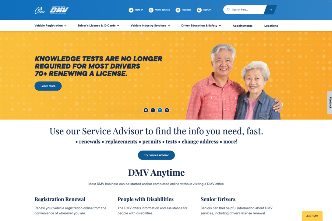
The California DMV website is a great go-to resource for all drivers. The top navigation is chock-full of information but is structured so as to not overwhelm the visitor. As one of the most frequently visited state websites, the California DMV site stands out for its well-organized content and commitment to serving a wide range of user needs efficiently.
Key Features
- User-Friendly Navigation: The California DMV’s site architecture is thoughtfully designed, allowing users to find the information or service they need with minimal clicks.
- Tailored Learning Materials: One of the site’s standout elements is its extensive library of driving guides and educational resources, which are customized to serve a variety of user groups. Guides for teen drivers, truck drivers, motorcyclists, and senior drivers are not only informative but also formatted to be accessible and easy to understand.
- Convenient Online Appointment Scheduler: Scheduling a driver's test is made easy with the user-friendly booking platform on the California DMV’s website. This feature is particularly valuable in a high-traffic state like California, where DMV offices are often busy.
Kansas City Government
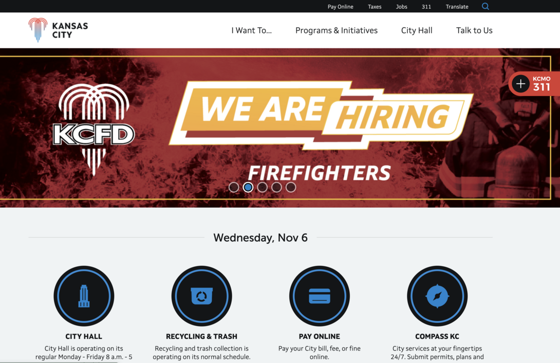
The Kansas City Government website exemplifies how local government sites can serve their communities by providing clear, resident-focused navigation and an intuitive interface. By prioritizing ease of access and organizing content around common resident needs, the website helps Kansas City residents find essential information and complete city-related tasks with minimal effort. It’s a model of how city websites can streamline the digital experience, making municipal resources accessible to everyone.
Key Features
- Clear Navigation: The navigation bar streamlines the resident’s journey through the website, providing easy access to high-demand services and resources they require. By grouping popular options under intuitive categories, this approach minimizes guesswork, guiding users through the site effortlessly.
- Resource Lookup Tool: As another supplemental resource, the Kansas City Government provides a tool where you can insert your specific address and gather information for your area from recycling pick-up days to voter information. It’s a standout example of how city websites can leverage personalization to improve accessibility and community engagement.
- Online Payments: Easily pay your bills or fees through their website. For residents who might otherwise spend hours at a government office, this feature offers a convenient alternative that saves time and promotes on-time payments.
Los Angeles Department of Water and Power (LADWP)
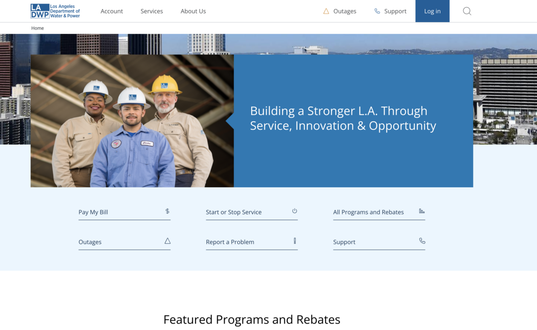
We couldn’t forget to mention the web design we’ve done for Los Angeles Department of Water and Power! Our approach kept user-friendliness at the forefront, prominently displaying key services that citizens look for instead of burying those resources and complicating the user journey.
Key Features
- Quick Access to Critical Services: Outage information, a bill payment portal, and a few other services are immediately available on the homepage. This focus on streamlined access helps residents stay informed and complete tasks efficiently.
- Mobile Friendliness: Recognizing that users access the site from a range of devices, we made sure the LADWP website is fully responsive. This mobile-friendly design provides a consistent and accessible experience, regardless of screen size or device.
- Compliance With Accessibility Standards: Offering clear text, easily navigable menus, and assistive features has improved the usability for residents with disabilities or cognitive impairments.
- Sustainable Design: The way we approached LADWP’s website was so that the platform could stand on its own with minimal required updates. By building with scalability in mind, we designed a digital infrastructure that supports LADWP’s mission to provide reliable, sustainable service to the residents of Los Angeles.
Denver International Airport
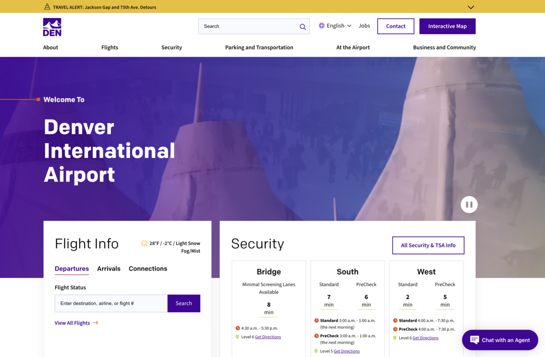
Denver International Airport’s website exemplifies how airports can enhance the travel experience through a well-organized, data-driven platform. By prioritizing real-time information and accessibility, the website helps travelers make quick, informed decisions as they navigate the airport. From checking flight times to locating the nearest open parking lot, the site delivers essential information that can reduce stress and streamline the journey. Traveling can already be a hassle, so the fact that DEN has been able to make the processes a little less of a headache is a huge achievement.
Key Features:
- Flight Information and Security Wait Times: At the top of the homepage, DEN places critical flight information and TSA wait times, allowing travelers to instantly view their gate, departure times, or arrival details as well as the estimated time they’ll spend in security.
- Parking Lot Status Updates: With updated data on available parking spots across various lots, travelers can view up-to-the-minute information on open spaces, saving time and avoiding the frustration of searching for a spot.
- Interactive Map: The DEN website’s interactive map is a vital tool for wayfinding, guiding travelers through the expansive airport with ease.
City of Oakland
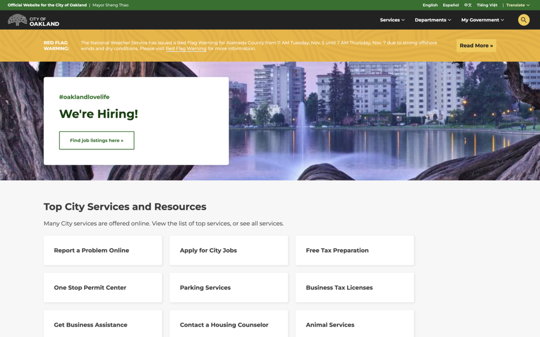
The City of Oakland website is a model of clean, service-oriented design, showing how government websites can provide essential information in a user-friendly, approachable format. By focusing on simplicity and clarity, the website effectively guides residents and visitors to the city’s services without overwhelming them. This design approach supports Oakland’s commitment to accessibility and community service, making it easy for users to find information and resources with minimal effort.
Key Features
- Clean "Services and Resources" Section: Featured on the homepage, residents can easily navigate the services and resources no matter if they’re searching for tax information, city jobs, parking services, etc.
- Multilingual Capabilities: By prominently featuring a translation button at the top of the page, it makes it easier for all visitors no matter what language they speak to get the information they require.
- Easily Report Problems: By clicking the “Report a Problem” button, citizens can alert the county of any infrastructure issues or crimes/violations.
Duke Energy
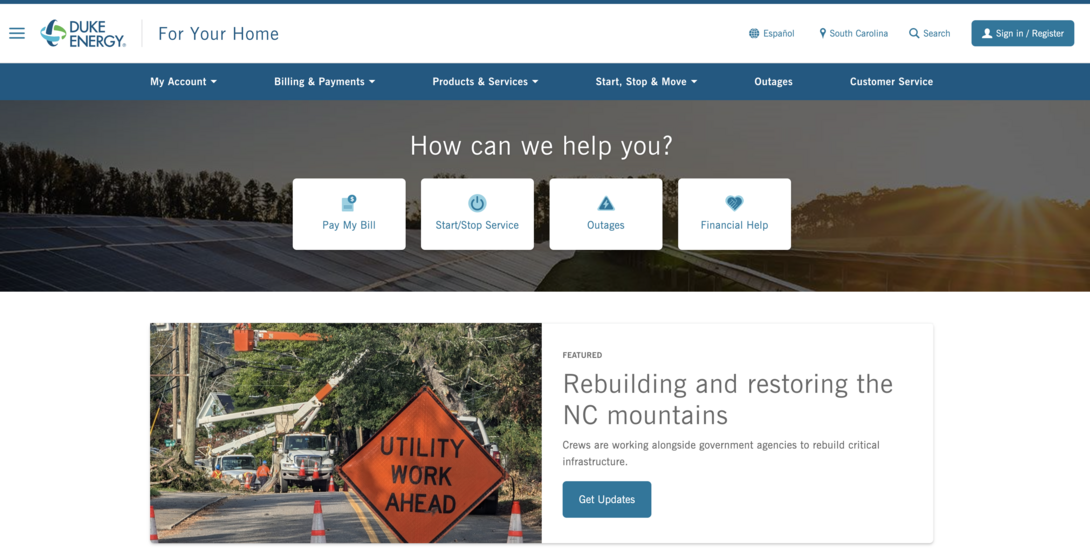
Duke Energy’s website is a prime example of how a utility company can simplify the digital experience for its customers by making key information easily accessible. Much like LADWP, Duke Energy’s site emphasizes straightforward navigation and relevant, localized content, which enables users to find the services and resources they need without unnecessary steps. By prioritizing clarity and personalization, Duke Energy creates a seamless and stress-free digital experience for its customers.
Key Features
- Straightforward Banner: The “How Can We Help You?” on the homepage provides an efficient entry point for users seeking assistance or information. Organized around commonly sought topics like billing, service issues, and account management, this section connects users to essential services and FAQs with minimal clicks.
- Customized Homepage: One of the standout elements of Duke Energy’s website is its ability to personalize the homepage based on the user’s location. By allowing customers to enter their region, the website tailors content, services, and updates relevant to their area, such as local outage information, payment options, and other region-specific updates.
- Mobile App Access: Duke Energy makes it convenient for customers to stay connected on the go by providing direct download links to its mobile app on the website. This app allows users to access essential services like billing, outage updates, and energy usage tracking directly from their phones, gathering vital information at their fingertips.
State of Hawaii
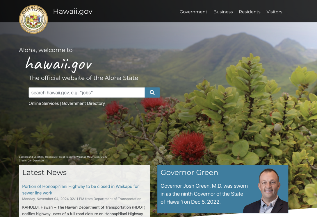
Hawaii.gov stands out as one of the most visually unique government websites, blending cultural elements with practical functionality. The site’s design is inspired by Hawaii’s natural beauty and rich heritage, incorporating visuals that reflect the islands’ distinctive identity. By integrating these cultural touches while maintaining high usability standards, Hawaii.gov creates an inviting digital experience that feels distinctly local. This approach not only appeals to residents but also welcomes visitors by giving them a genuine sense of Hawaii’s character right from the homepage.
Key Features:
- Culturally Relevant Design: The Hawaii.gov website thoughtfully incorporates island-inspired iconography, colors, and fonts to bring the spirit of Hawaii to life. These visual elements are carefully woven into the site’s layout without compromising usability, engaging users through design while providing easy access to essential information.
- Simple Search Bar: The Hawaii state website doesn’t overwhelm the visitor and instead provides a sleek search bar that helps them easily navigate through their online services and government resources.
- Segmented Resources: Hawaii effectively serves both residents and visitors by organizing resources based on user needs. For residents, the site provides easy access to essential services and local resources, while visitors who are vacationing can quickly find information on transportation, events, and other recreational activities.
U.S. Department of State
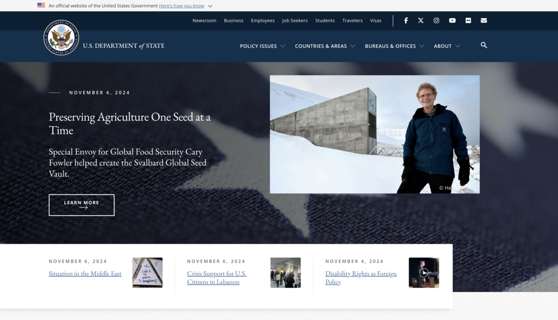
State.gov implements clear organization and mobile-friendly design, helping users easily find the resources they need, from travel advisories to policy updates. Designed to meet the needs of individuals on the go, the State Department’s website supports efficient information access regardless of device, enhancing the user experience.
Key Features:
- Clear Navigation: State.gov prioritizes user-friendly organization, making it easy for visitors to locate relevant information quickly. Key resources like policy research, press releases, and details on various U.S. bureaus and offices are intuitively categorized, helping users find what they need without having to sift through unrelated content.
- Mobile-Friendly Design: Optimized for those who are on the go, you can view the website on any device. The responsive design adapts fluidly to smartphones, tablets, and desktops alike, allowing users to view content without needing to zoom in or adjust their screens.
- Global Information Resource: This website goes beyond providing U.S.-centric content, serving as a comprehensive global information platform. In addition to updates on domestic policies, users can access a wide range of international news, global events, and resources, keeping U.S. citizens and global stakeholders informed about developments worldwide.
State of Maryland
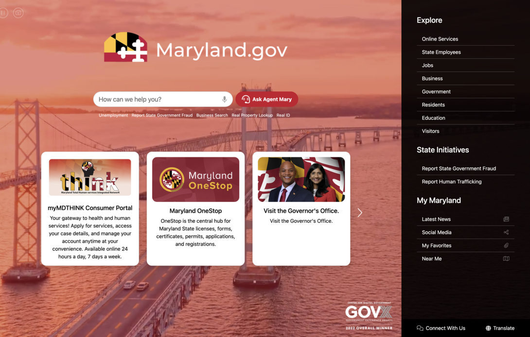
The interactive elements of the State of Maryland website cater the platform to the users, helping residents find services, resources, and even COVID-19 information in just a few clicks. Maryland’s design and navigation are simplified with useful features and capabilities sprinkled throughout the platform which positively impact the visitor’s experience.
Key Features:
- myMDTHINK Service Portal: This is a one-stop shop for a wide range of state services. Residents can access essential services including healthcare applications, housing assistance, family and child support services, and much more — all within one centralized location.
- Virtual Assistant Integration: While many government websites offer a search bar, Maryland goes a step further by providing an integrated virtual assistant. This virtual assistant enhances user support, enabling visitors to type or speak their questions and receive guided answers in real time.
- Pin Your Favorites: On a majority of the website links, you can click on the paperclip icon and favorite resources. This feature is especially useful for residents who may regularly return to the same resources such as unemployment support, healthcare benefits, or local news updates — allowing them to build a customized dashboard of frequently accessed services.
Greenville South Carolina
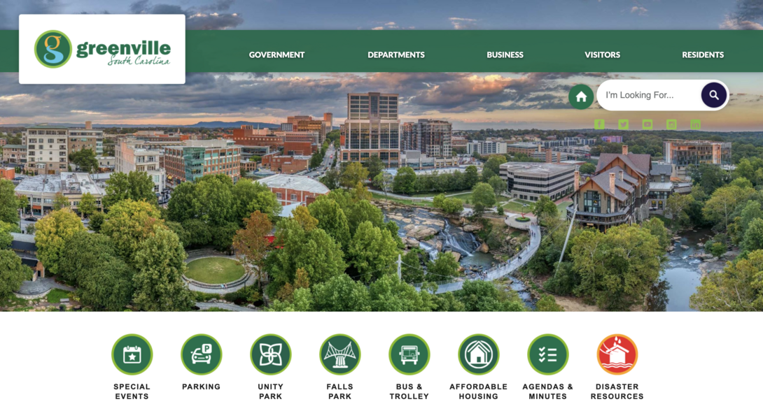
A common theme across the top government websites we've discussed is the importance of the "above-the-fold" banner. Greenville County’s website follows this best practice by placing key resources front and center, delivering the necessary resources citizens need.
Key Features
- Simple & Effective Banner: By prominently displaying quick links for community information, such as disaster resources and local events, the banner enables residents to take immediate action without scrolling or navigating through multiple menus.
- Event Calendar: Users can quickly find information on relevant events, helping them stay informed about what’s happening in their community. This transparency and accessibility make it easier for people to participate in civic and community-building efforts.
- Resource Segmentation: Greenville’s navigation is neatly organized into sections for Businesses, Residents, and Visitors, allowing users to find resources based on their specific needs. This segmentation makes it simple for residents to locate municipal services, for businesses to explore local incentives or permits, and for visitors to access tourist information.
Key Takeaways on The Best Government Sites
If you look closely, one common thread among all the websites we've highlighted is their focus on user-centered design. As we move into 2025, it’s crucial to prioritize the needs of your visitors when planning your next web design project. By focusing on intuitive and accessible design, you can significantly boost citizen engagement.