Many of us often take for granted the ability to quickly use the internet to find the information we need in seconds. However, those with cognitive disabilities don’t always get to experience this luxury. Cognitive disabilities include conditions such as dyslexia, autism spectrum disorder, ADHD, and various memory impairments. Unlike physical, auditory, or visual disabilities, cognitive disabilities may affect how users process, understand, and respond to information online.
By addressing cognitive accessibility, we can create an inclusive digital space that supports users in processing information easily, navigating websites confidently, and interacting with content without feeling overwhelmed. In today’s digital-first world, accessible design isn’t just a consideration — it’s a critical factor in creating equitable, user-centered experiences that allow everyone, regardless of ability, to benefit from digital tools and resources. How do we achieve this? Let’s go over some of the techniques our team often uses to foster an accessible web experience that’s intuitive, supportive, and engaging for all users.
The Importance of ADA Compliance
We’ve previously mentioned Web Content Accessibility Guidelines (WCAG), and this standard continues to be refined with WCAG 2.2 and they released a working draft for version 3.0 back in May 2024. These best practices help you comply with ADA (Americans with Disabilities Act) web standards. This law helps drive inclusivity and prohibits discrimination across the web by enforcing design standards that provide accessibility for all.
How many people does this impact exactly? Well, according to the CDC, about 13.9% of adults in the United States have a cognitive disability. Complying with ADA standards can actually benefit all users since it pushes design practices that help create websites that are easy to digest/understand. For example, simplifying content and using visual aids can enhance comprehension for individuals with cognitive challenges while simultaneously improving usability for those without such barriers.
This universal design approach not only creates a more equitable digital landscape but also encourages creativity and adaptability in web development practices, ultimately leading to richer, more engaging online experiences.
Principles of Cognitive Web Accessibility
Web accessibility seems like a no-brainer, but it’s still something that continues to be a barrier for users. In fact, according to a recent study conducted by Acquia, 89% of consumers experience accessibility issues that make it challenging to interact with websites offered by brands. To successfully create accessible web content, several principles should guide the design process. These principles help users find information easily and navigate without frustration.
Simplicity in Design
A clean, straightforward design minimizes distractions and allows users to focus on essential tasks. Avoiding clutter, excessive animations, and complex layouts enables users to process information more effectively.
To accomplish this, use clear typography, limited color palettes, and consistent layout structures. Such practices help maintain users' attention and reduce cognitive overload, making it easier for them to engage with the content. Also, incorporating ample white space can enhance readability and provide visual breaks, allowing users to absorb information without feeling overwhelmed. This approach not only caters to individuals with cognitive disabilities but also benefits all users by creating a more enjoyable browsing experience.
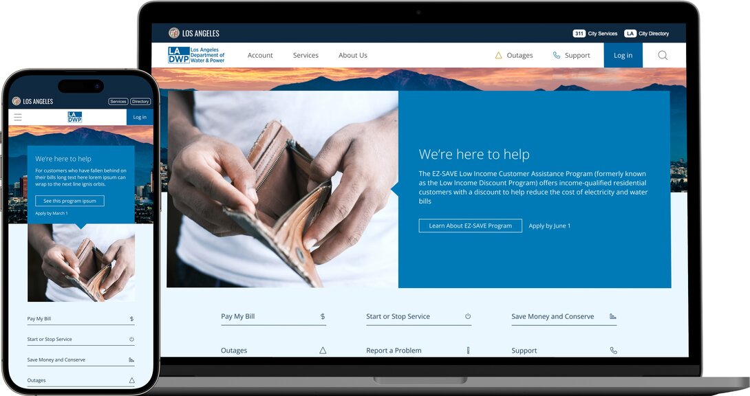
A perfect example of this is the project we completed for the Los Angeles Department of Water and Power. As a large utility provider, they need to have a website that’s intuitive and easy to navigate so that the citizen experience is painless. After all, we already don’t enjoy paying our water bill, so why make the process more cumbersome?
Our team was able to redesign the website so that there was an 80% faster login and bill payment process. As a result, we received great positive feedback from their users saying they no longer dread going to a government website.

Consistency in Navigation
Consistency in navigation refers to maintaining uniformity throughout the website's layout and pathways. When users can anticipate how to navigate a site, they are more likely to feel comfortable and confident in their interactions.
This can involve using familiar iconography, repeating navigation elements, and making sure that menus remain in the same position across different pages. Such consistency reduces confusion and assists users in locating information efficiently. Additionally, implementing breadcrumb navigation can provide users with a sense of place within the site, allowing them to backtrack easily if they stray from their intended path. This not only reinforces the navigational structure but also empowers users to explore the content at their own pace, enhancing their overall experience.
Clear Instructions and Feedback
Include straightforward language in instructions and make sure that feedback is immediate and easy to understand. For instance, if a user makes an error when submitting a form, clear prompts on how to rectify the mistake can significantly enhance their experience. In addition, visual cues such as highlighting fields that require attention or providing examples of expected input can further clarify the process. By integrating these elements, users are not only informed but also reassured, fostering a more positive interaction with the site. Engaging users with supportive messages, such as confirmations upon successful submissions, can also enhance their sense of accomplishment and encourage continued interaction with the content.
Web Accessibility Best Practices
Implementing cognitive web accessibility requires certain best practices you don’t want to leave off of your to-do list. Here are a few of the big components you should keep in mind:
ALT Text
A small but crucial item you want to make sure you keep on your radar is ALT text. Providing accurate descriptions of the visuals on your website helps screen readers appropriately describe the content on the page. Think about what information is the most important for those who cannot see the page. For example, the following image could have ALT text that says “woman seated at a table typing on a computer”:

Use of Plain Language
Plain language is integral to cognitive accessibility. It involves using simple vocabulary and sentence structures to convey information. This practice reduces ambiguity and reduces the chances of users struggling to comprehend the information on your website.
While tailoring content to your target audience is essential, it’s equally important to balance that with making information clear and accessible. This is particularly crucial for government websites, where enhancing the citizen experience often involves crafting straightforward, easy-to-navigate content.
Including visual aids such as icons or images alongside text can further enhance understanding, making the content more engaging and easier to digest. Using formats such as a checklist can help users understand and follow instructions better, reducing cognitive load and promoting better retention of information.
Providing Helpful Error Messages
Error messages should be constructive and informative, facilitating a seamless user experience. Instead of technical jargon, use clear, relatable language to explain what went wrong and how to correct it.
For example, instead of merely stating "Input error," a helpful message could read, "Please enter a valid email address, such as example@domain.com." This type of feedback empowers users to correct their errors effectively. Additionally, offering suggestions or examples of acceptable formats can further guide users, minimizing frustration and enhancing their confidence in navigating the website. Incorporating visual cues, like highlighting the input field in red or providing an icon next to the error message, can also draw attention to the issue and facilitate quicker resolutions.
Color Contrast
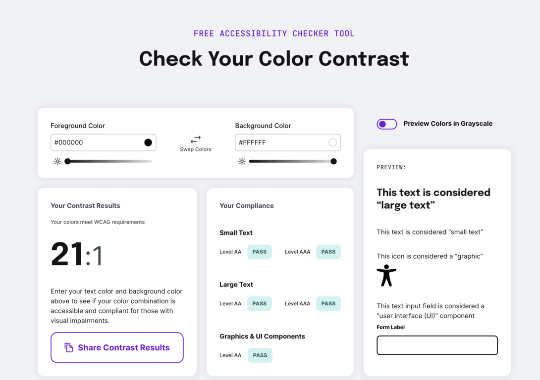
If the background color of your website is too similar to the text color, this will naturally make it harder for most users (even those without a cognitive disability) to read and digest the content. This is especially true for those who are color blind for example. Make sure your text has a color contrast ratio of at least 4.5:1.
If you Google “color contrast checker” you can find a variety of free tools that help evaluate your website’s colors such as this one from AudioEye:

Semantic HTML
For coding, semantic HTML are tags that clearly define the type of content that’s on the page. Good examples of this include:
<header>
<footer>
<button>
<p> (paragraphs)
Utilizing this framework helps assistive tools identify the content that’s on the page for those with cognitive impairments. It’s also an easy and effective way to organize the code language for your website.
Legal and Ethical Considerations
When developing websites, it’s important to be aware of the legal and ethical implications surrounding cognitive web accessibility.
Numerous laws and regulations govern web accessibility, including the Americans with Disabilities Act and Section 508 of the Rehabilitation Act in the United States. These mandates require public-facing websites to be accessible to individuals with disabilities, including cognitive impairments.
While the Web Content Accessibility Guidelines (WCAG) aren’t law, they offer a comprehensive framework for making web content more accessible. Understanding these guidelines not only aids in compliance but also serves as a best practice for enhancing user experience across diverse audiences.
Tools That Help Developers Create Accessible Websites
We’ve mentioned in the past that our team has often used Google’s Lighthouse tool to identify design flaws and any navigation difficulties a user might encounter. For digital web experiences, we also utilize Acquia which offers its own optimization tool. Acquia Optimize can scan your website, give you a performance score, and provide suggestions as to how you can boost inclusivity for your users.
The W3C also provides a list of many other web accessibility tools that can help evaluate your website and identify potential areas for improvement. Many of these tools can typically highlight color contrast issues that may affect users with cognitive impairments or offer visual feedback on accessibility errors directly on the webpage. By utilizing these tools, developers can gather essential data to continuously refine their websites. Moreover, integrating automated testing into the development workflow can streamline the process, allowing for quicker iterations and more responsive design adjustments.