
Okay, so we’ve started a trend for sharing the best websites for each industry, so we figured we have to keep the tradition alive. Get ready for our latest list of the best government websites for 2026.
What are we looking for when we create this lineup?
We’re tracking down exactly which websites are geared towards the visitor. Meaning: websites that deliver content in a way that’s accessible, easy to consume, and features functionality that doesn’t overcomplicate the user journey.
The wait is over, let’s dig in.
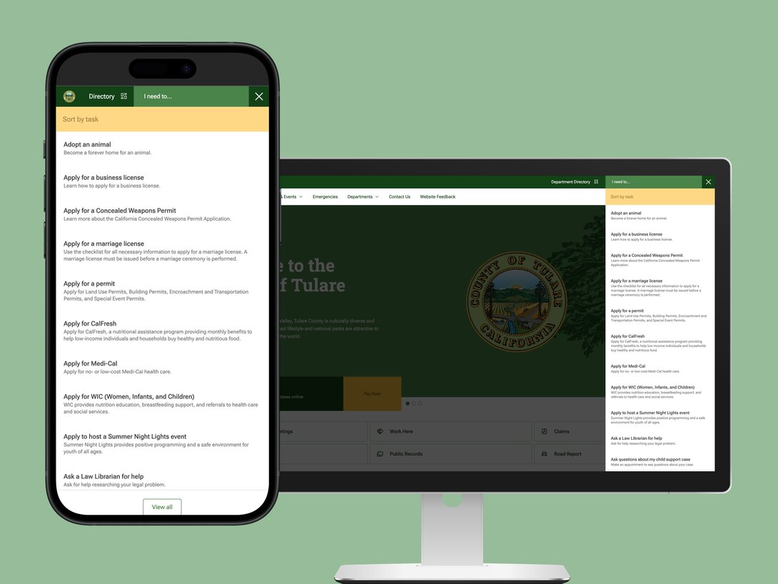
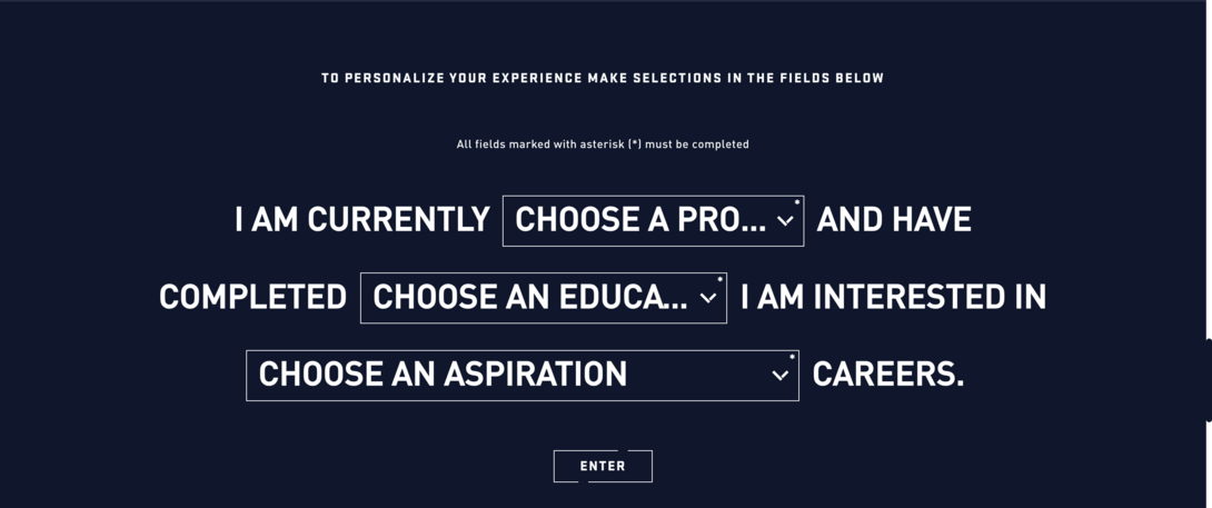
1: Tulare County
First on our list is a California County with 50+ websites they manage across numerous departments. They recently underwent a massive redesign, which involved migrating from a deprecated Mura instance to Drupal. The goal for this revolved around streamlining their content management processes, all while cultivating a seamless user experience for all of their residents.
We worked with them on completing this project, which involved incorporating accessibility best practices, clear design, and brand consistency. The results speak for themselves: Tulare County has now experienced an 85% uptick in overall site performance and continues to receive positive feedback on the new design.
With features like an “I Need To” task-based filter dialog, the county makes it easy for visitors to filter and select what services they need most.
Interested in learning more about how this was done? We have some behind-the-scenes content ready for you.
2: NOAA
We’re all familiar with the National Oceanic and Atmospheric Administration (NOAA), but their website is worth calling out! Their homepage features critical information a visitor might need during that given time, such as dangerous winter storm alerts. Meanwhile, on the left-hand side, easy-to-understand icons are featured where you can click to expand the navigation and consume various categorized information.
One thing that screams “they care about the user” is the fact that they have a big button on the bottom right that says “Help improve this site”. What’s the significance? It’s the fact that once you click on that button, it opens up a user survey you can fill out to give them feedback on the experience you’re having while browsing their site. This is a great way to gather info from real people who are consuming your site’s content.
You can filter content by inserting your location to receive weather information specific to where you live. This provides a personalized piece that can expedite the user journey by getting them what they’re looking for faster.
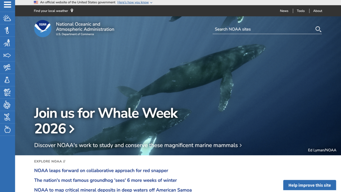
It’s safe to say that NOAA has a little bit of everything that users look for in a digital experience, including filtering, easy navigation, a place to give feedback, etc. Being a weather agency, up-to-date content is a must, and they’ve cracked the code on presenting/delivering that information.
3: Oregon.gov
Oregon is the perfect example of a state government website that contains a ton of information but makes it simple and clean for users to filter and search through the content. Take the homepage, for instance. All there is above the fold for your eyes to center on is a simple search bar with suggested popular search terms to find the topic or service you’re looking for.
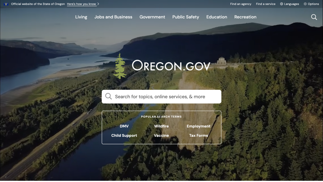
The top navigation is properly organized with verbiage that makes the most sense for actions visitors commonly take when visiting a state site. Terms like “Change of Address”, “Change of Name”, “Find a Case or Court Record”, are all actionable phrases that people are likely searching for in Google and browsing your site for.
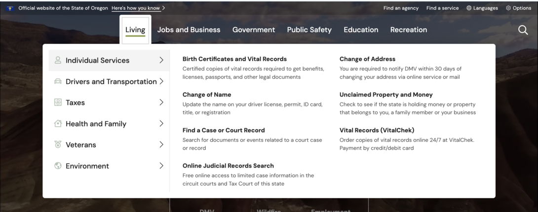
These actions are also categorized by who you are and what department you might be searching for. For example, there are individual services relating to what you own and can change. Similarly, there are categories for driving/transportation, taxes, family services, and more. Governments handle too many areas to be disorganized; it’s time to take some notes from Oregon and craft your website so your users spend less time sifting through things they don’t need, and get to their desired destination faster.
4: U.S. Air Force
Whenever we’re looking for good qualities in websites and when we’re busy crafting our own, personalization is a huge aspect of improving the user experience. Gone are the days when you can create web content that’s a “one size fits all”. Nowadays, users want to feel cared about and seen, and since you likely have different audience buckets, it’s time to design your site with that in mind.
The U.S. Air Force is a great example of leveraging personalization and filtering to help their visitors sort through the programs/fields they offer. Many visit their site for career opportunities, so in order to help users start their job search in a way that feels a little less intimidating, they feature this filtering option that allows them to quickly explain in 3 clicks who they are and where they’re at in their career. Once they input that information, the search function generates recommended career paths that the Air Force offers. You can then click on that role and explore the page that covers it in more detail, or explore all the careers the Air Force offers.
They understand that job searching is a huge portion of the web traffic they receive, so making it centered around that action and ensuring it’s a personalized and seamless experience is hitting the nail on the head for their industry and audience.
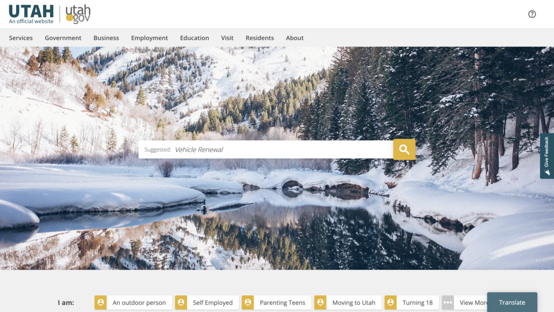
5: Utah Gov
The official site for Utah’s state government is another great example of prioritizing search and the user persona. It’s vital for government organizations to architect their websites that are centered around the typical individuals who will be visiting your site on a daily basis.
Similar to what we did for Tulare County, Utah’s website not only features a search engine but an interactive section below it that allows users to select “who they are” so that the content will filter to show topics and services that pertain most to them and their needs.
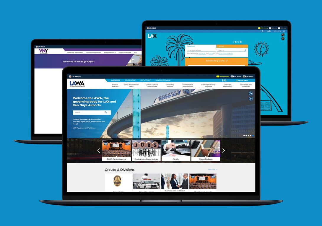
6: LAWA
Another personal favorite of Hounder’s are the websites for Los Angeles World Airports. Yes, this includes the infamous LAX. We worked with their team to successfully migrate their website to Drupal as their previous platform was being deprecated.
In doing so, our team was able to help them achieve:
- 96% faster page load speed
- 75% improved web stability
- 20% increase in operational efficiency
All of which in the end drives a huge impact on their user experience! When visitors face outdated systems and frustrating navigation throughout the site, it can put a damper on how they perceive your brand.
Throughout this process, we even helped build custom APIs so that tools like baggage tracking, flight statuses, and traffic updates all work seamlessly through their new web platform. These are all essential services that travelers flock to when visiting a site like LAX.
This proves that while complete redesigns are sometimes necessary, sometimes it’s the platforms themselves that might be holding you back, and transitioning to a future-forward solution can significantly improve the user experience.
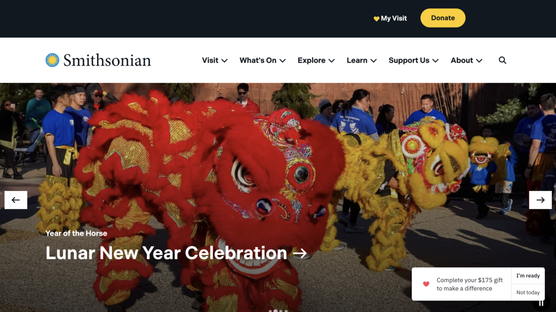
7: Smithsonian
Everyone knows the Smithsonian, but have you checked out their website? It’s clean, and features must-have navigation items along with important alerts at the top of their page. Donations are a huge part of the success and growth for organizations like this, so having a clear donation button and pop-up on the bottom right is a great way to get the visitors engaged.
They even help users plan their visit via the “My Visit” button, where you can start favoriting exhibits and creating a list so you can create an itinerary for yourself. Features like this are unique and show that the Smithsonian is prioritizing their specific audience and caters to fit their needs.
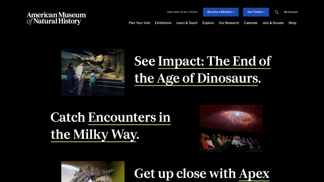
8: American Museum of Natural History
Another museum that’s knocking it out of the park with their website is the American Museum of Natural History. While they incorporate a striking design, they still get their message across and make key actions pop out to the user. This includes important items such as becoming a member and getting tickets ahead of time.
Their particular design doesn’t overwhelm you, and makes users want to scroll further down the page since more content is peeking above the fold to give you a preview of what’s next. This is the perfect strategy to maintain engagement since you want to entice visitors to scroll further down the page instead of bouncing if they feel like they’ve seen all they need to.
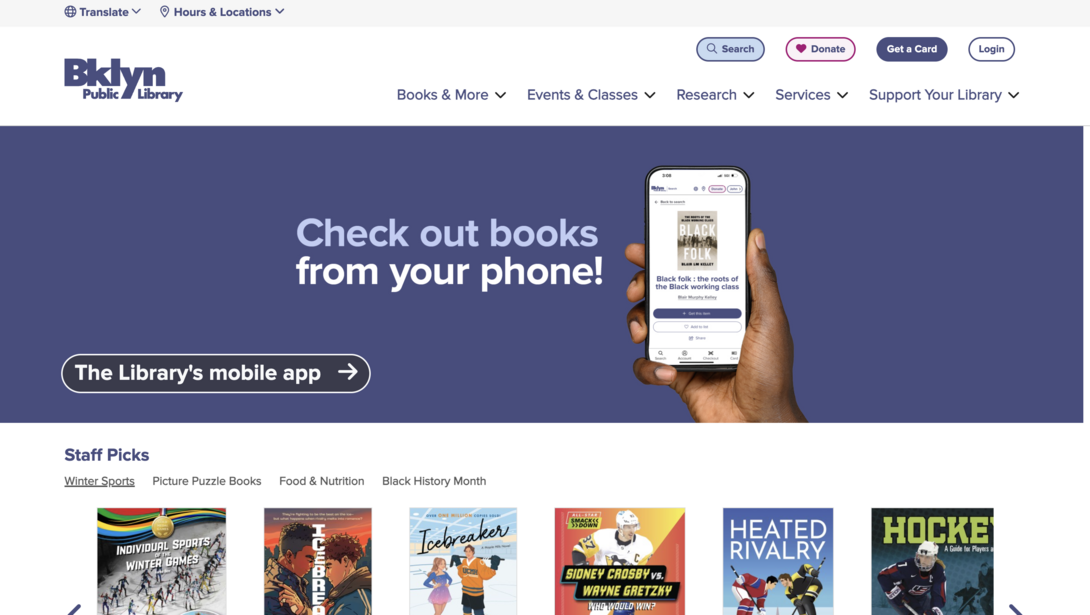
9: Brooklyn Public Library
While making this list, we came across a lot of libraries that needed some help with their websites, but Brooklyn Public Library wasn’t one of them! They’re definitely one of the ones leading the charge with a clean and easy-to-navigate website.
They nicely display actions such as making a donation, getting a library card, and logging into your account if you have one already. With government websites, accessibility is also key, which is why they clearly show where you can translate the page to the language you speak/prefer.
The library’s banner isn’t overwhelming but sufficiently communicates upcoming events/key information.
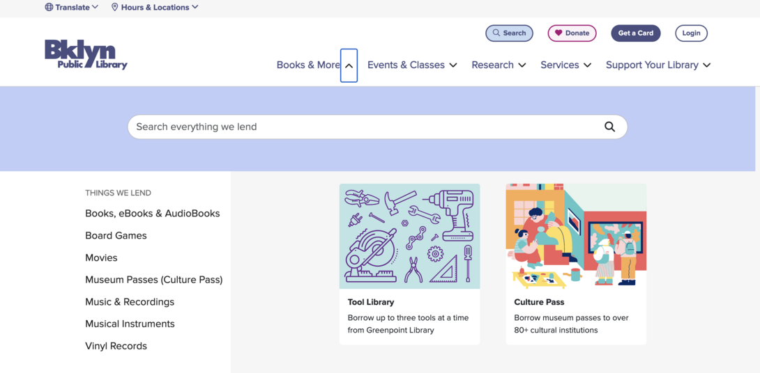
Their navigation expands to include a search engine where you can search their entire database for items that they lend. This streamlines the user experience by quickening the process for visitors to find exactly what they’re looking to get from the library.
10: New York State Government
Last but not least, we wanted to shout out another New York entity, and that’s the state’s website. It’s easy for a state/local government’s website to get out-of-date, but they’re doing things right in NY.
Popular services are placed front and center, minimizing confusion and addressing key services that their residents need to access daily. In addition, the banner only touches on key information and displays straightforward Call-To-Actions (CTAs) for visitors to dig further into that topic.
While many of the government organizations we’ve covered featured robust navigation and mega menus, New York State takes a different approach and takes you straight to Services, Programs, Government, and News pages once you click on them up at the top. There’s no right or wrong to these differing navigation approaches; it just depends on the user journey you’re trying to have the visitor walk through.
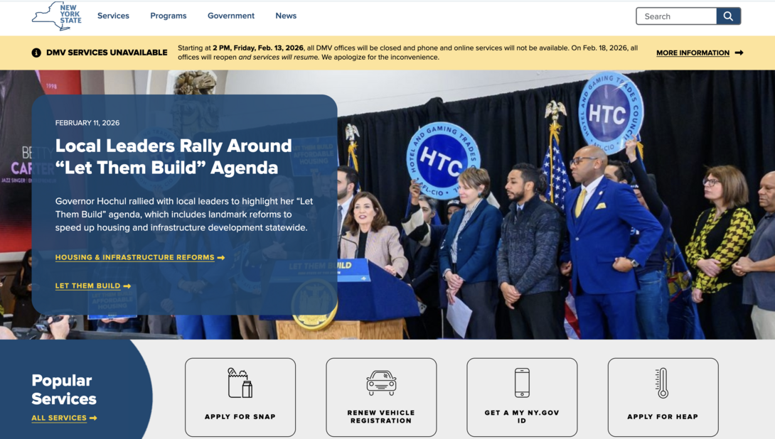
We love filtering functionality here at Hounder, and New York State leverages filters in a great way. For example, if you click on “Programs”, you can easily filter by topic and/or use the search bar at the very bottom to refine your search even further.
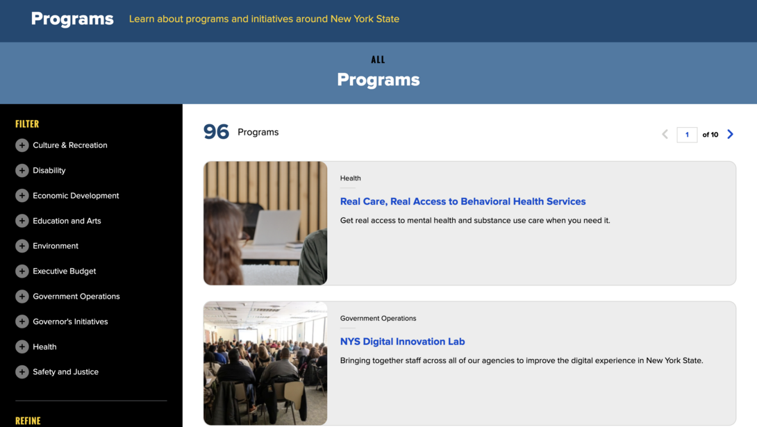
Filtering can either simplify or overcomplicate your website, and the way they’re executing it on the New York State website is a great example of simplifying the user experience.
Ready to get in the top 10?
If you noticed some features or some areas that need some extra love on your own website and digital channels, now’s a better time than ever to turn them around! It may seem daunting to execute a full-blown website redesign or migration, but that’s exactly what we’re here for.
When you’re ready to give your website the facelift it deserves (and your users deserve), Hounder is here to become an extension of your technical and creative teams. Let us take some of the work off your plate so a project like this can feel more manageable and achievable.
It’s 2026, and your users expect more from government websites. If your site still feels dated, confusing, or hard to use, now’s the time to act. The good news? Fixing it is absolutely doable. We’re ready when you are.