Scientists rethinking stormwater management
Founded in 2016 by Nicole Beck, 2NDNATURE was created to rethink and reengineer how we view and manage stormwater. 2NDNATURE's forward-thinking team of innovative scientists are engineering highly effective SaaS solutions to address the fastest-growing source of pollution in the United States: Stormwater.
The history of 2NForm
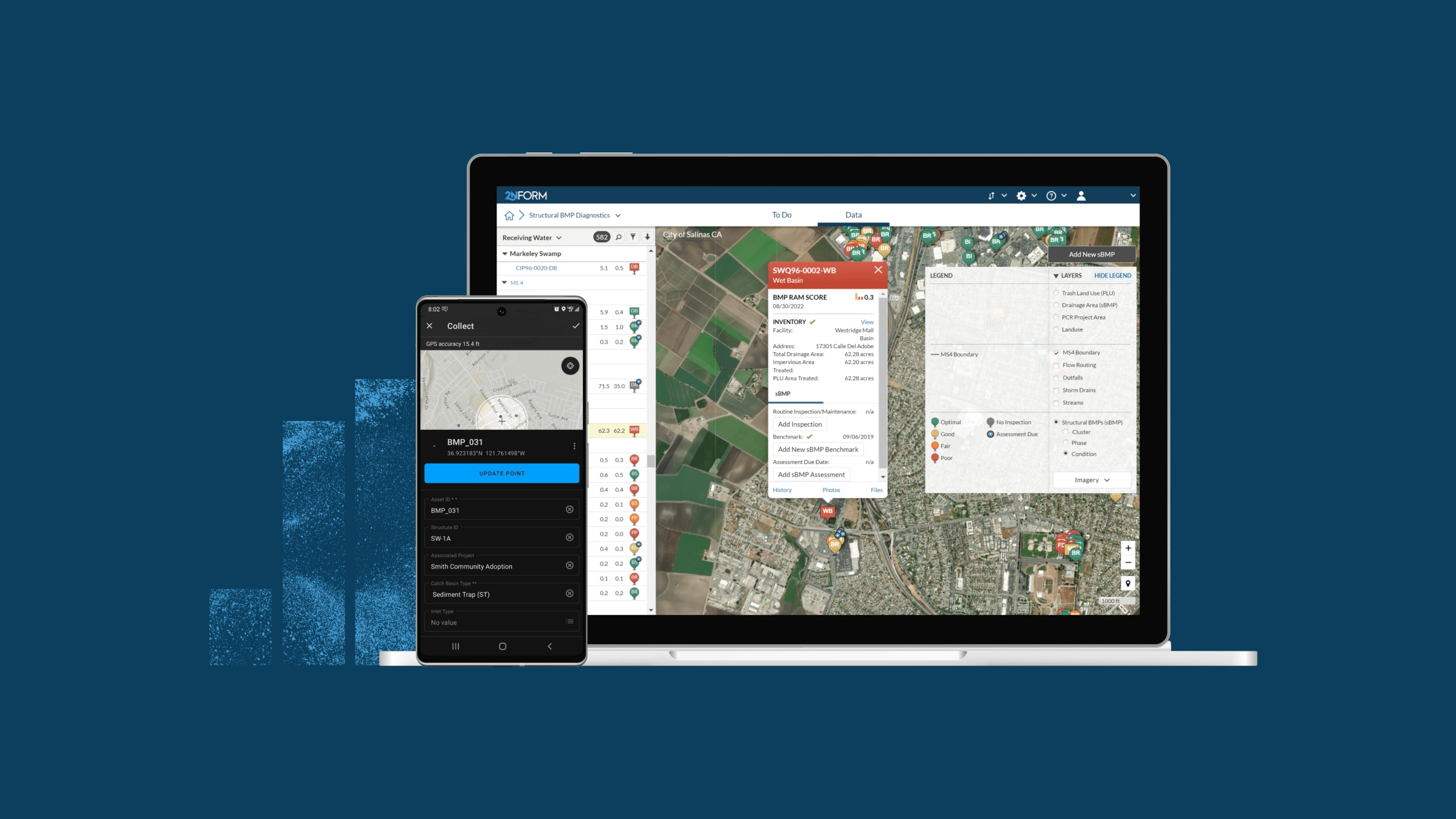
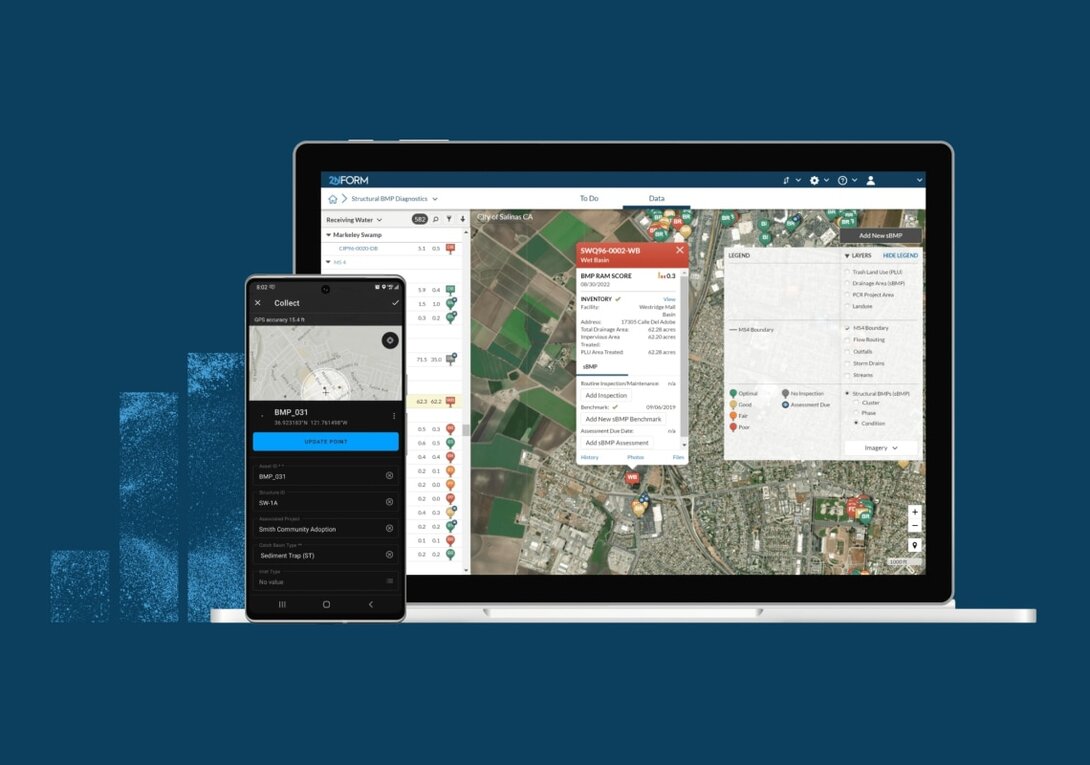
2NDNATURE created 2NForm, an intuitive app that makes it easy for governments to remain compliant with stormwater regulations. 2NForm makes the collection, tracking, and mapping of data during field inspections easy. This has allowed stakeholders to make environmentally conscious decisions, primarily to reduce stormwater pollution in lakes, rivers, streams, and urban runoffs. The collected data is examined and made available to local residents via a public dashboard, where they can monitor the state of their water systems. By making this data accessible through their app, 2NDNATURE is able to inform disadvantaged communities most affected by stormwater pollution and create greener, environmentally conscious cities by helping improve stormwater infrastructure.
The solution
Hounder’s development and design teams worked with 2NDNATURE to craft a simple yet impactful site that explains the intrinsic value of stormwater management. This site was designed with care down to the details, complete with water motifs guiding juxtaposing technical and environmental imagery.
Process: Creative constraints
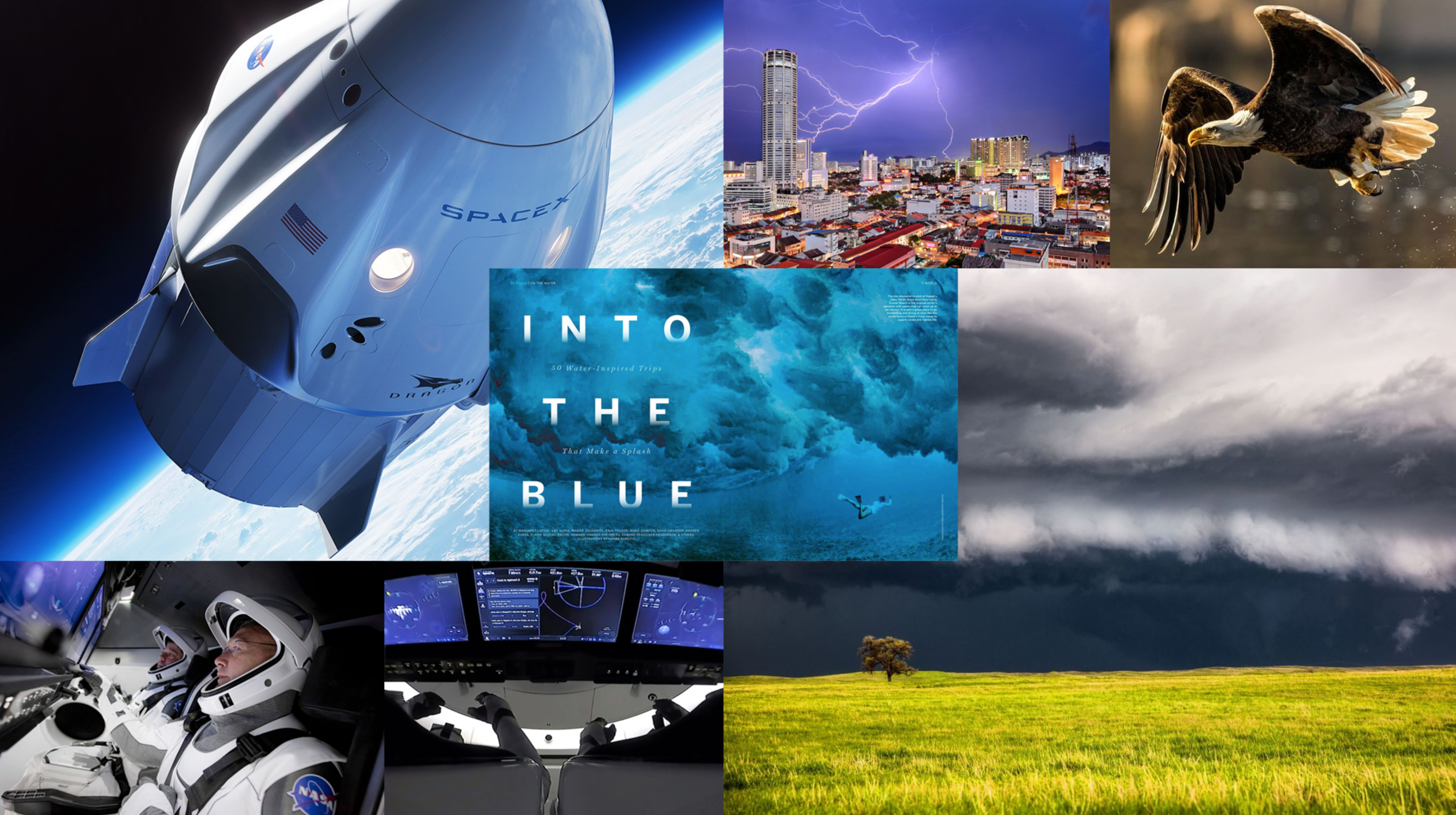
National Geographic meets SpaceX
Creating constraints keeps website design consistent and professional-looking. To keep our designers' ducks in a row, Hounder and 2NDNATURE teams agreed on the high concept National Geographic meets SpaceX, illustrated via the provided mood board.
Establishing the water motif
Keeping in line with 2NDNATURE's water theme, our designers created elements such as droplets, clouds, waves, and a mist-like scrim effect, strategically designed to guide site-wide storytelling.
Just look at the home banner for the starkest example of this. A blue, texturized water droplet pattern overlays background footage of stormwater drains, a flowing river, and a stormwater management team at work. Center banner, a sharply designed water droplet acting as a CTA invites site visitors to scroll down the homepage with one simple click. The list goes on, but you can be sure that every water-related design choice has at least one thing in common with the others: They must fall under NatGeo meets SpaceX, with a simple and clean appearance.
Menu design flooded with animation
2NDNATURE’s navigation menu design was another crucial component for establishing the water motif. Click the dropdown and blue fills the screen, waves brimming at the surface, quickly draining to reveal your desired page. The curvature at the menu's top bar also represents water, with fluidly drawn tildes separating titles from body text, adding subtle accents of movement to the page.
Font highlight: IBM Plex
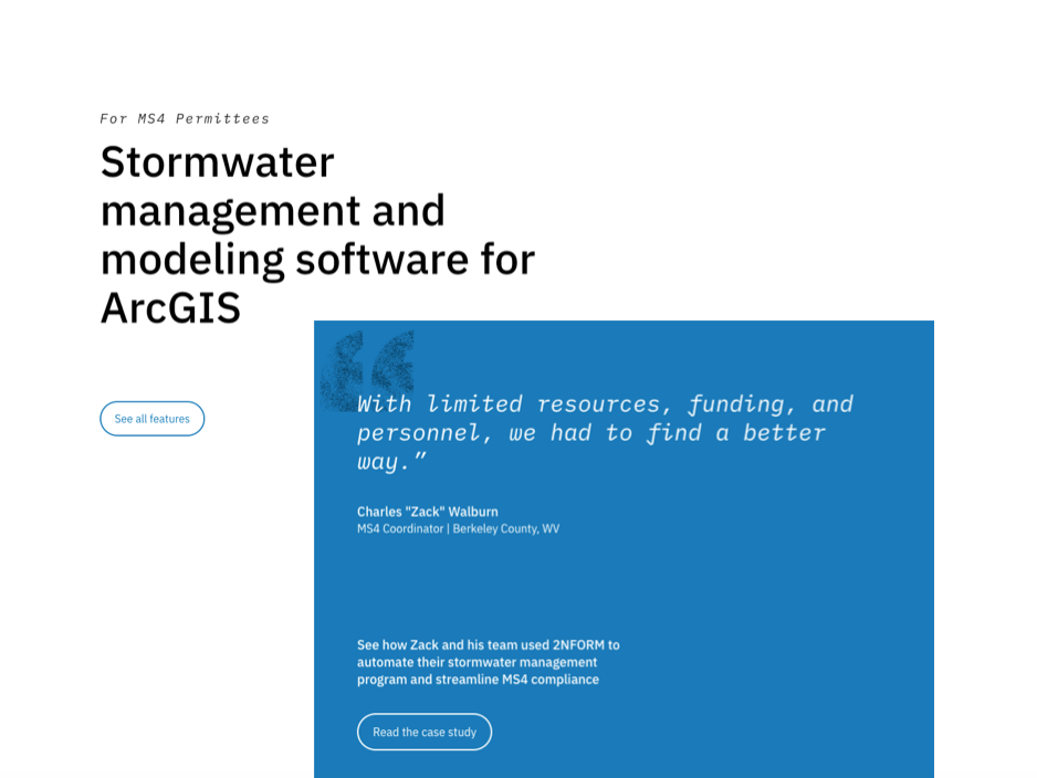
The highly technical font, IBM Plex, reflects 2NDNATURE's future-forward attitude. However, using a bolder font like IBM Plex, with all its angled serifs, can be risky. It can impose too much 'aesthetic' and leave the message behind. Being mindful of a balanced economy of distribution with these types of fonts, our designers only used it for strategically chosen text real estate, such as banner titles, quotes, and CTA headings. This helped make sure our designers didn't blindside the site visitor with too much styling.
Combining organic with technical
Informing the public about the environmental effects of stormwater is crucial to 2NDNATURE's mission, which is why we made sure that their new site's imagery evokes a sense of environmental responsibility and dedication to education.

Adhering to our established high concept, we juxtaposed wildlife imagery with technical imagery to imply that these two spheres of existence are not mutually exclusive. To achieve an effect not unlike that of National Geographic magazine spreads, the wildlife imagery works to support 2NDNATURE's dedication to natural environments, with an added effect of evoking a feeling of adventure and discovery.
To successfully execute the SpaceX-inspired portion of the design, you'll notice that everything is simple and logically placed, keeping the site balanced against the more creative design aspects. The best example of the NatGeo and SpaceX rule is probably the juxtaposition of drone or satellite imagery with eye-level, human-centric perspective: The city skyline and maps fitted with natural scenes featuring 2NDNATURE scientists hard at work.
Custom icon design
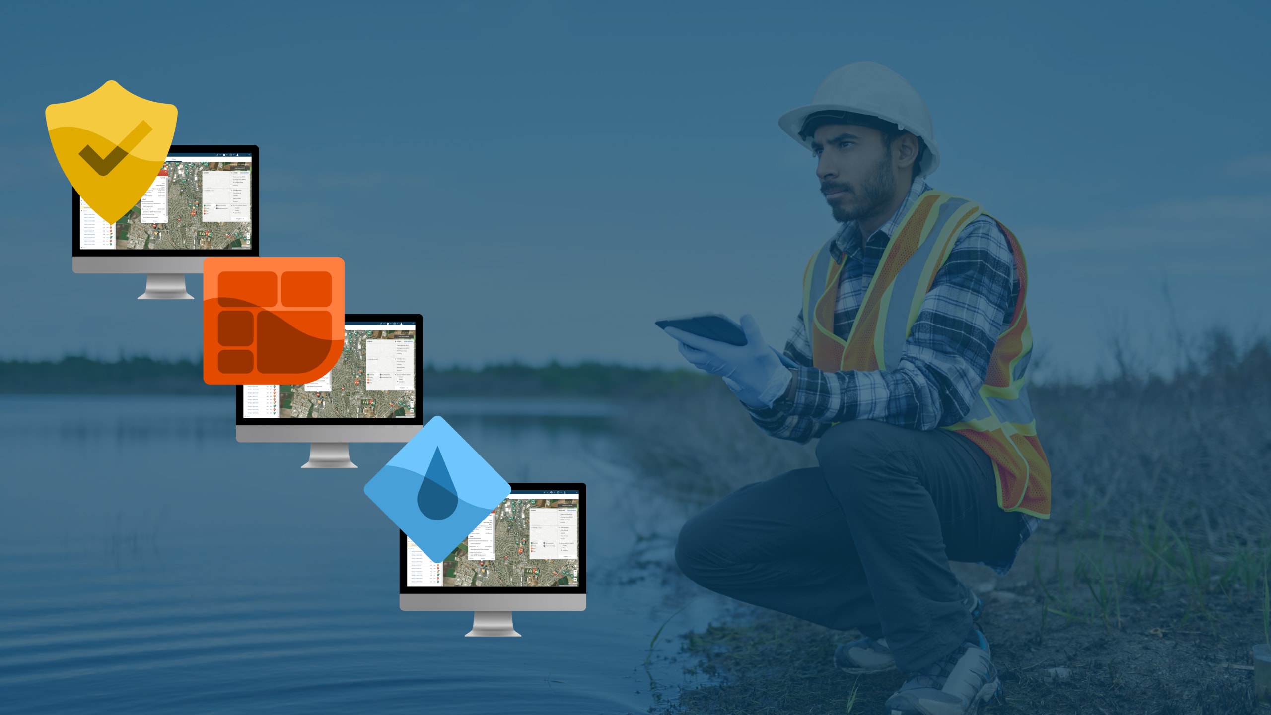
Icons are a huge part of a SaaS product because they quickly communicate the outcome of the software's intent to the user/site visitor. SaaS companies tend to build multiple products for multiple use cases under a central problem/purview, so creating simple and direct icons to tell these varying yet interrelated stories is crucial. Here, we used badges to differentiate 2NDNATURE's different use cases: Water science, mapping, and compliance.
The result
With 2NDNATURE, it's second nature
By closely collaborating with 2NDNATURE's impeccable team, we were able to deliver an impactful website that reflects the important work they do to help cities prevent stormwater pollution and build water resiliency into the infrastructure. Hounder redesigned 2NDNATURE’s website with a cohesive theme and custom imagery that complements the knowledge and environmental efforts of 2NDNATURE’s scientist-led team, with strategic navigational menus and page-by-page journey that guides site visitors exactly where they need to go.
